Anh

Anh Vu, product designer. I build digital experiences where every detail has a key purpose.

Hi, I’m Anh, I build digital experiences where every detail has a key purpose.

About me

Nice to meet you, I’m Anh!

Anh, pronounced “ahn”

[Your photo]
hi, that's me ♡

I started with watercolors and ended up designing software. Turns out it’s the same instinct: noticing the details and making things feel right.

Painting led me to graphic design, and scrolling way too much social media got me curious about marketing and how products talk to the people who use them.

Product design is where it all clicks. It starts with empathy for the people on the other side of the screen. Then I bring a visual eye and storytelling to complex products, working with product and engineering to make them feel simple, human and genuinely helpful.

Hats I wear

What I bring to a team

Off the clock

Little things that keep me curious

matcha ritual
sushi dates
new cities
stardew nights
bún riêu sundays
making content

In the box under my desk

Side quests

Passion projects, competition entries and brands I dreamed up, just to see how far an idea could go.

Just for fun: every side quest is a self-initiated concept. None were commissioned by, or affiliated with, the brands shown.

Duolingo Riddles

Young Ones 2025 entry · unofficial concept

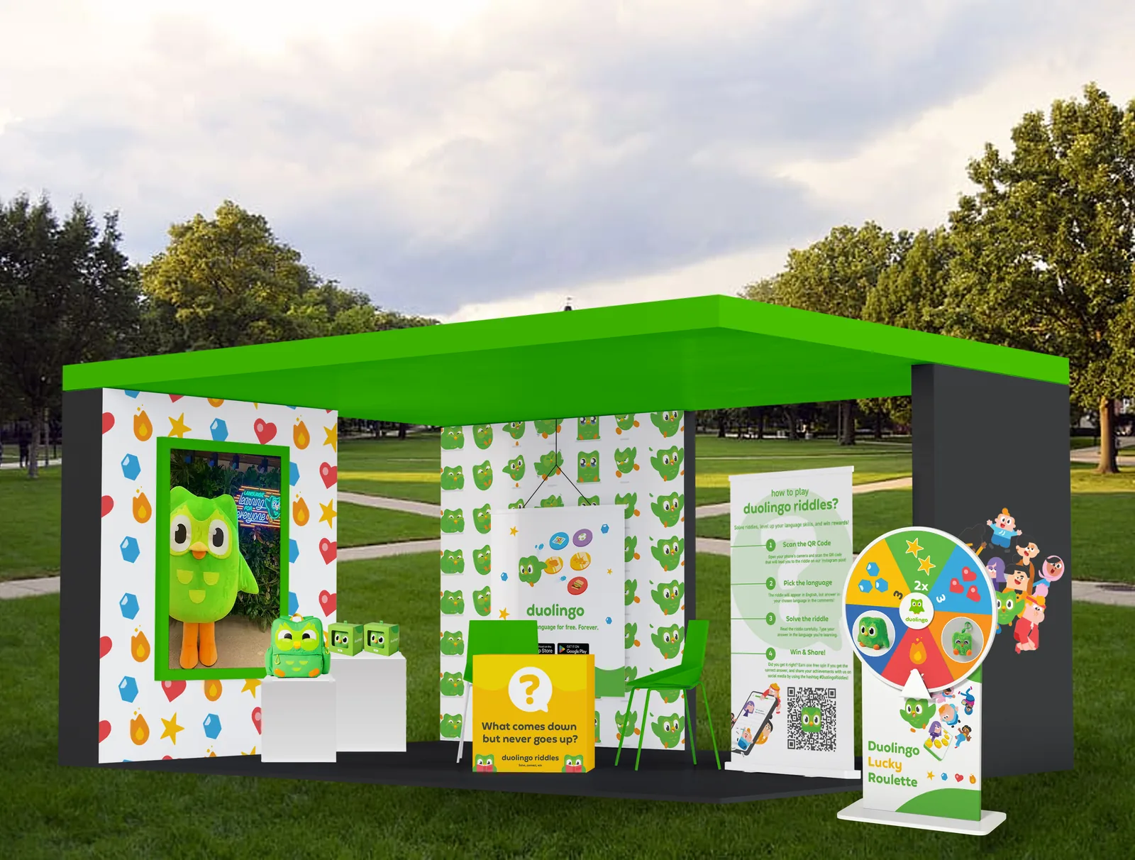
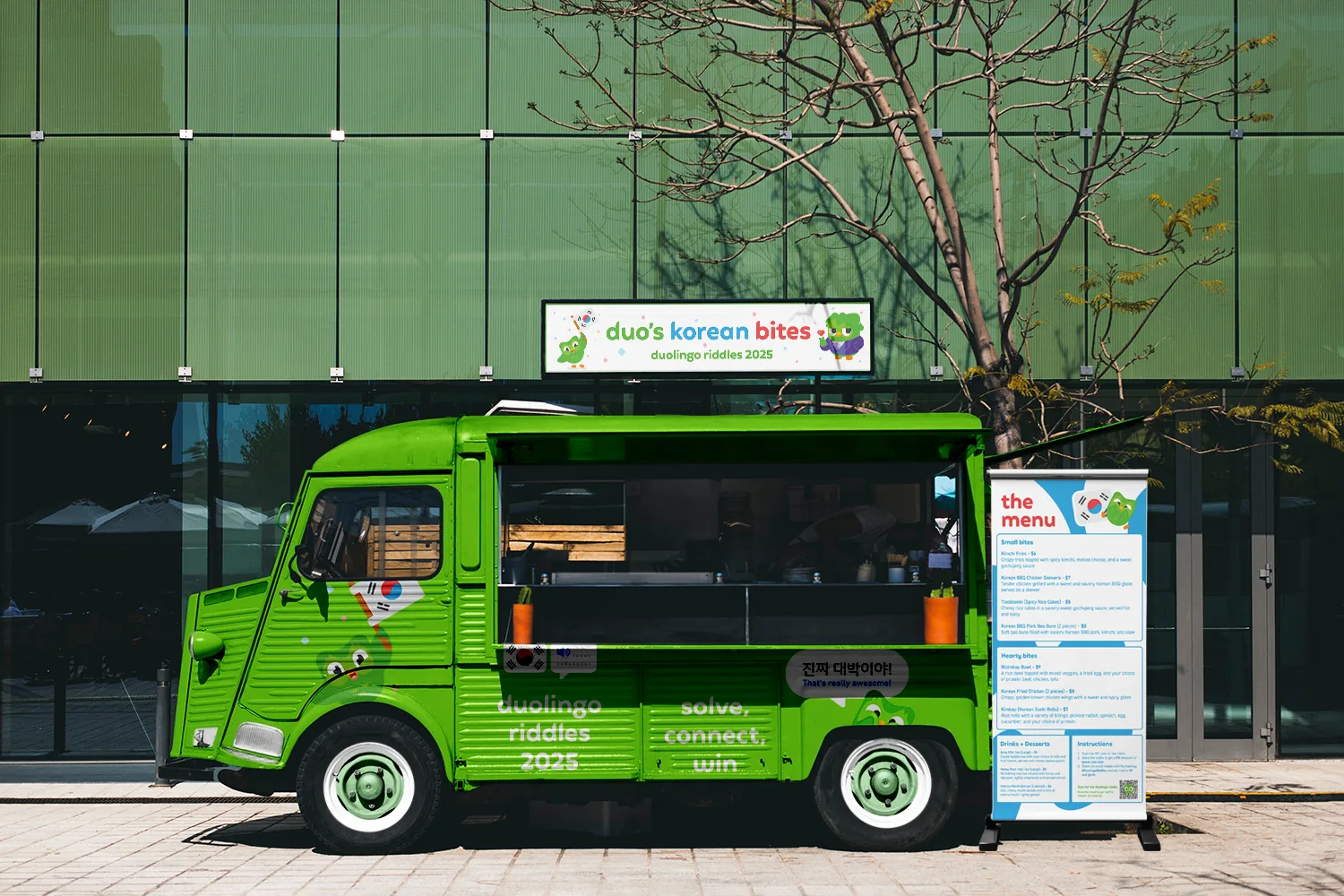
How do you get people practicing a language outside the app? Turn the city into the lesson. Riddles pop up on benches, bus shelters, food trucks and café tables. Scan, answer in the language you’re learning, and win XP, gems or a spin of the Lucky Roulette.
  • Campaign
  • Out-of-home
  • Experiential
Duolingo Riddles pop-up booth with a riddle desk, prize wheel and how-to-play banner
Duo’s Korean Bites food truck wrapped for Duolingo Riddles
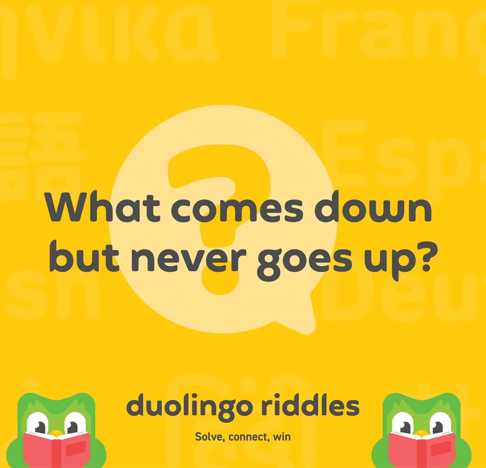
Riddle post: what comes down but never goes up?
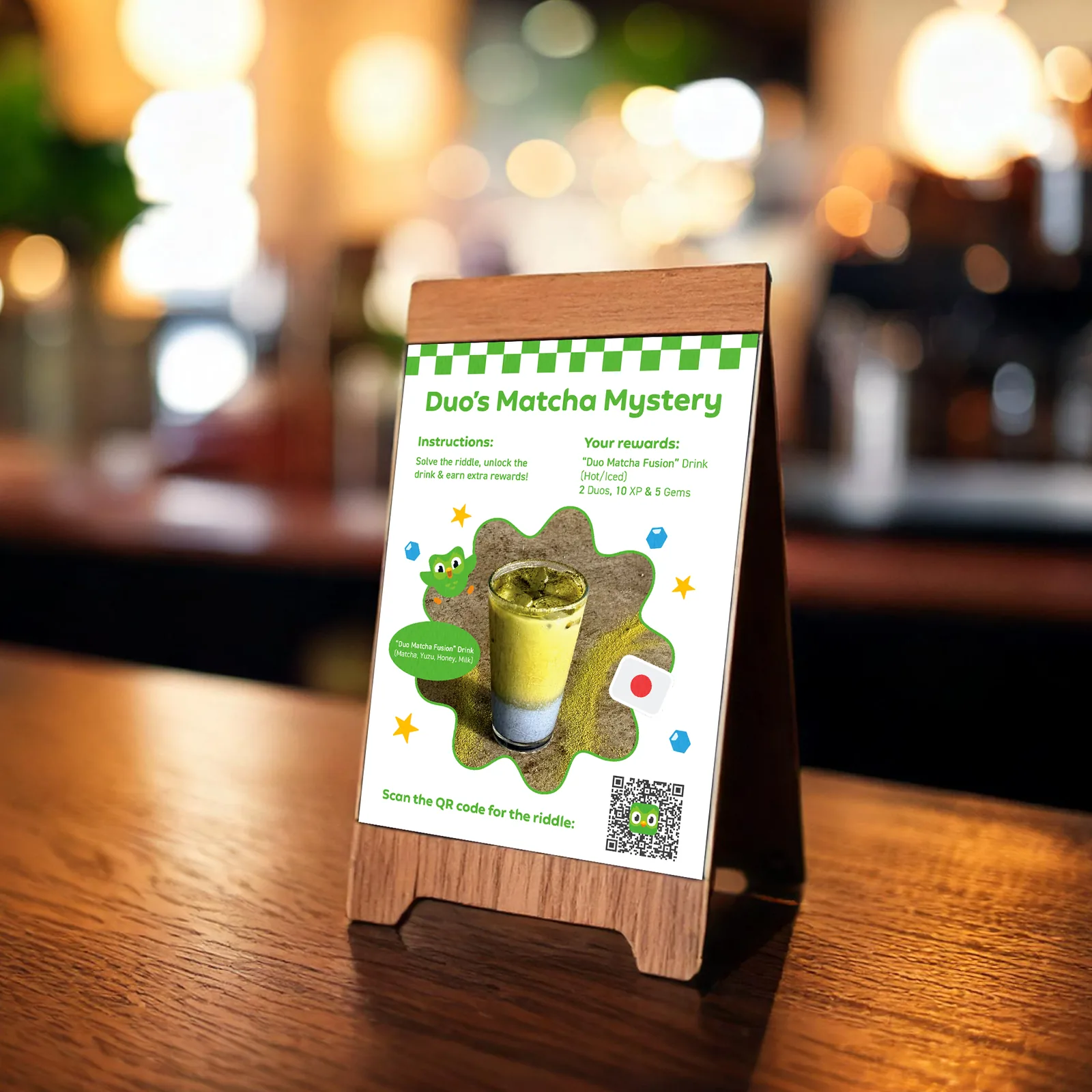
Duo’s Matcha Mystery table tent with a QR code riddle
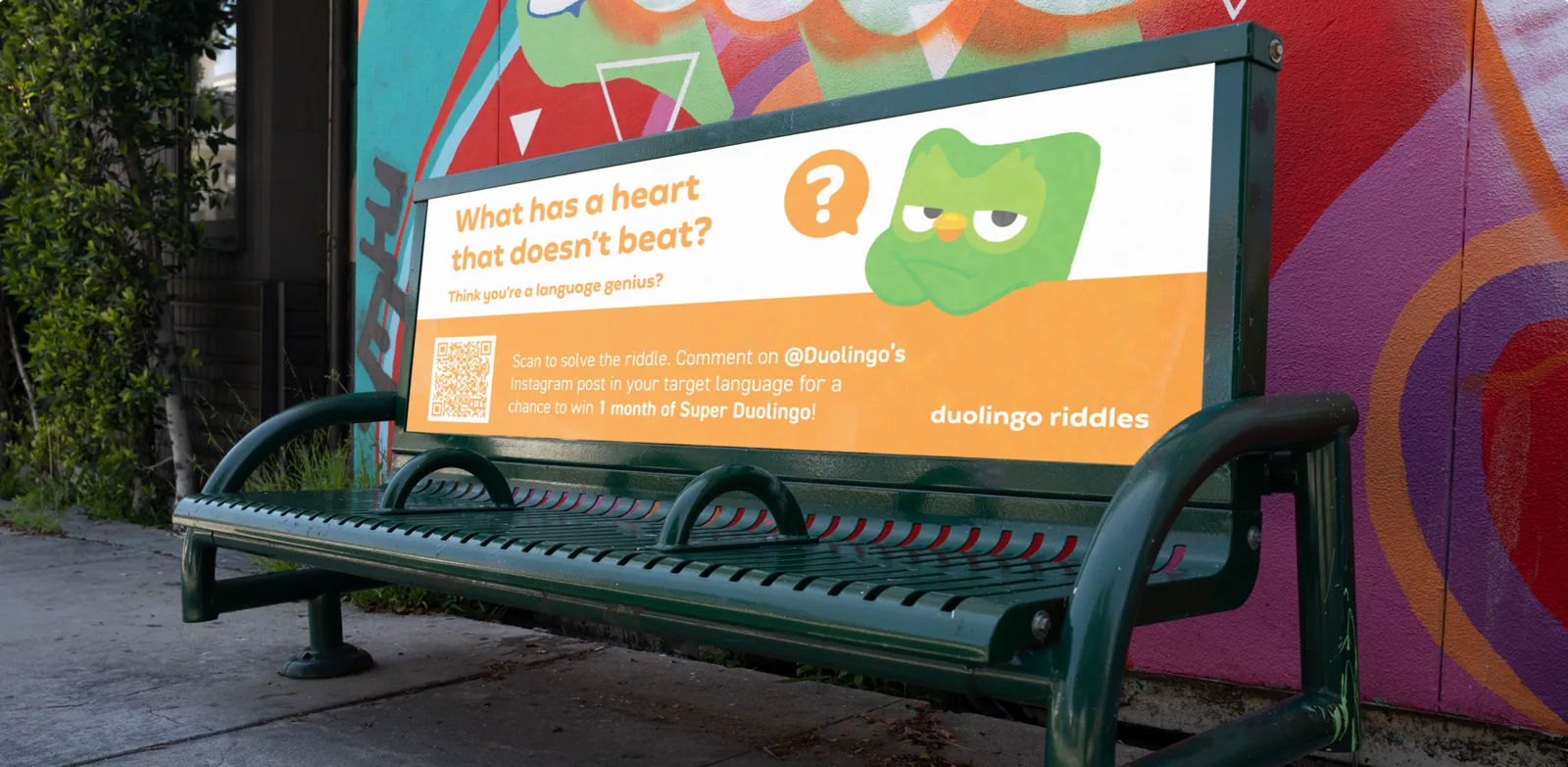
Orange bench ad: what has a heart that doesn’t beat?
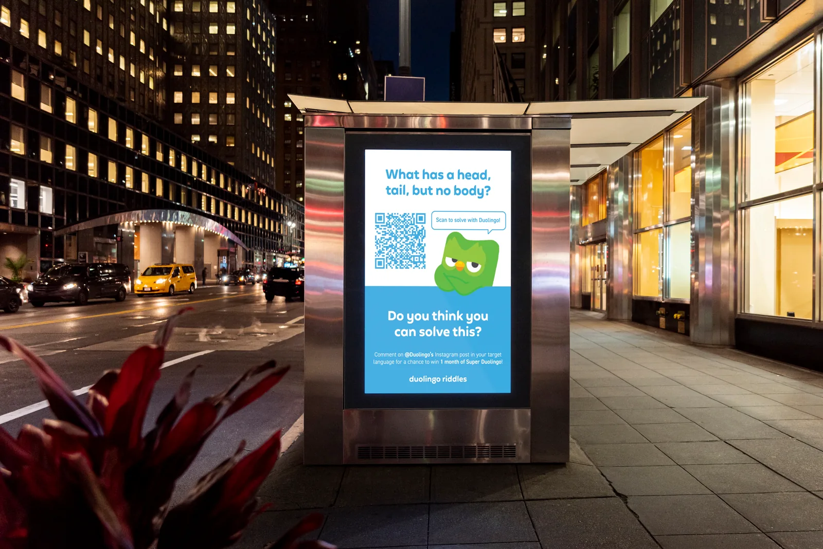
Bus shelter ad at night: what has a head, tail, but no body?

Phin Coffee

Concept brand

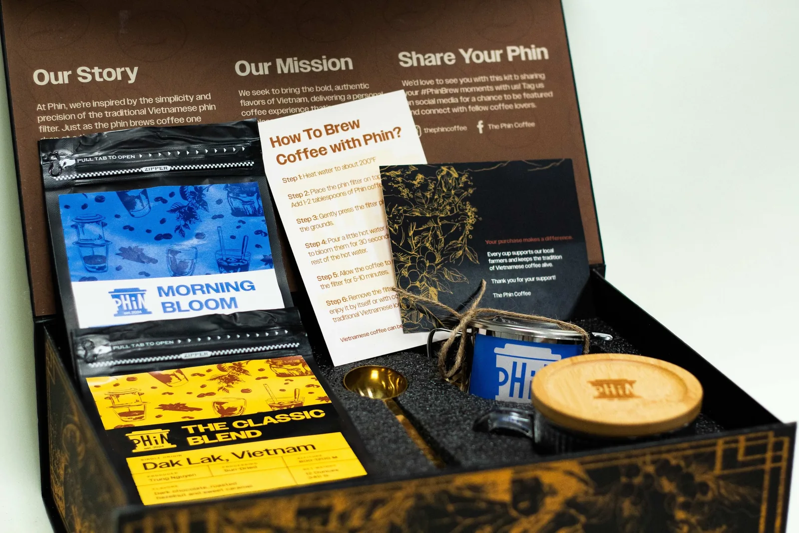
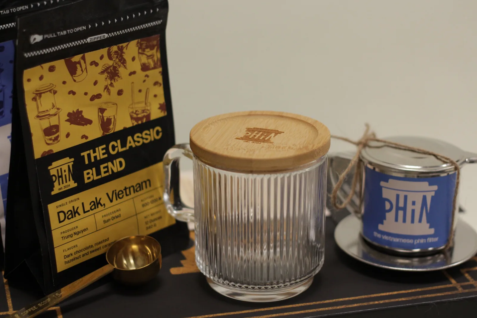
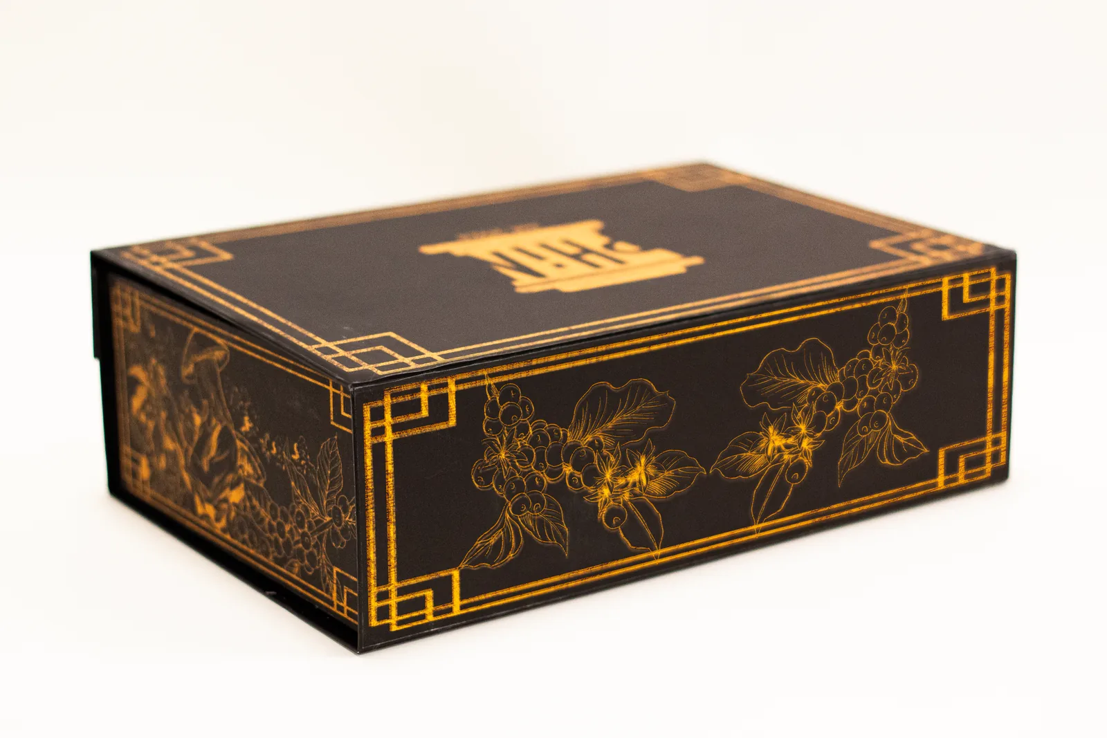
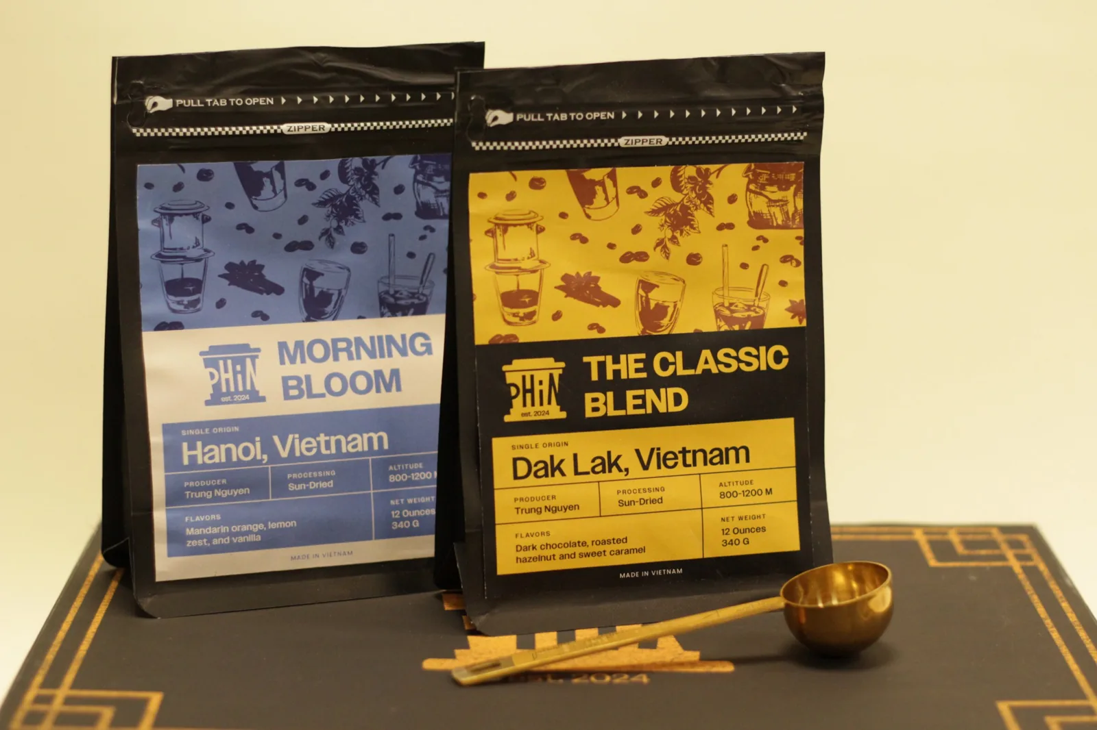
A Vietnamese coffee brand built around the phin, the little filter that brews one slow drop at a time. Custom bags, an engraved bamboo lid and a gold-foil gift box with a brew guide inside.
  • Packaging
  • Branding
  • Print
Open Phin gift box with two coffee bags, a phin filter, glass mug and brew guide
The Classic Blend bag next to a glass mug with an engraved bamboo lid
Black and gold Phin gift box with coffee-branch illustrations
Phin coffee bags: Morning Bloom and The Classic Blend

Rooted Yoga & Wellness

Concept brand · Austin, TX

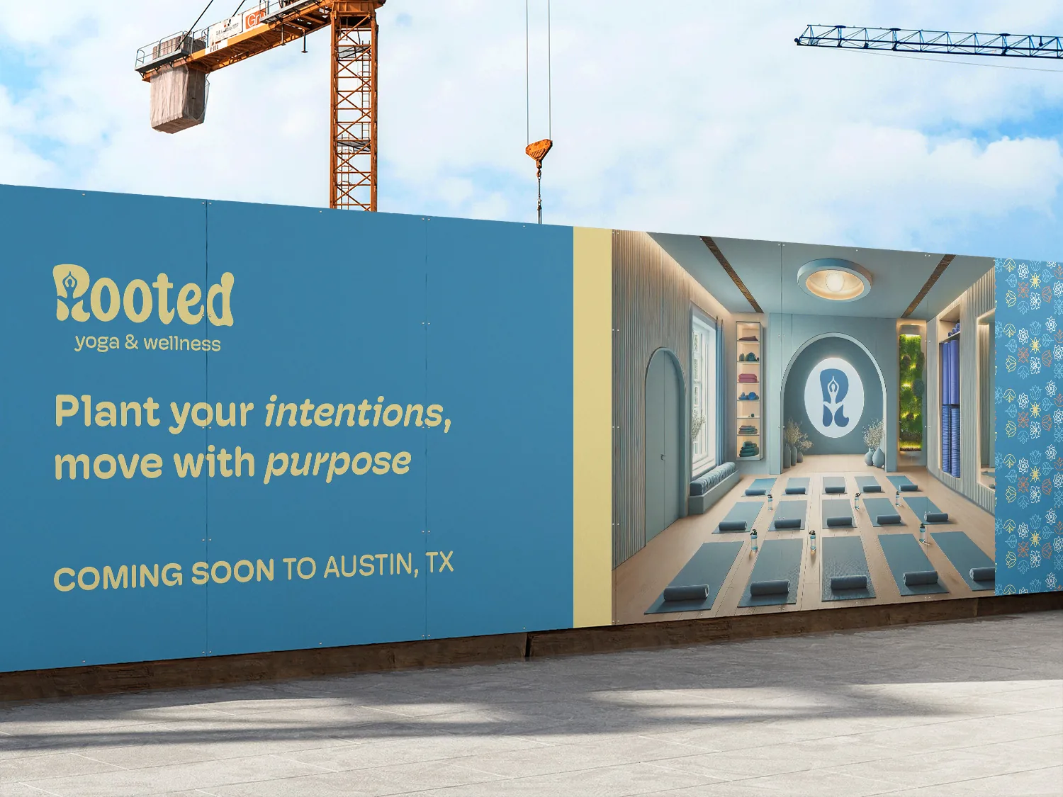
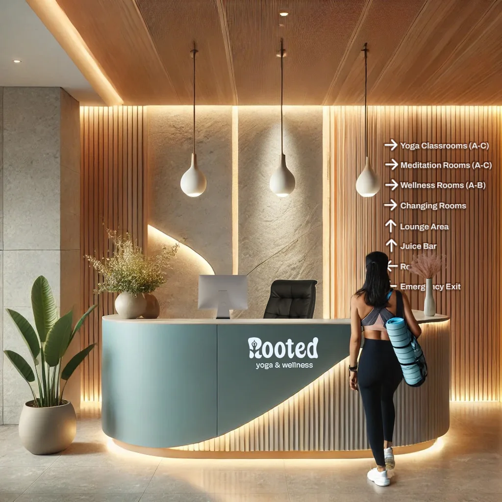
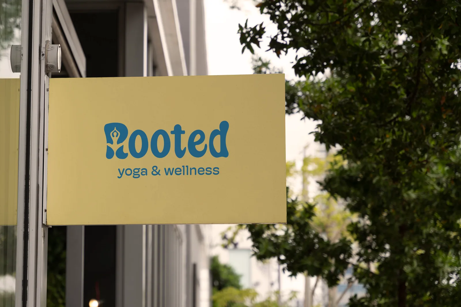
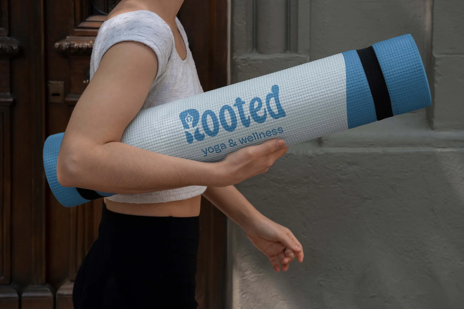
Branding for a yoga and wellness studio, where the R doubles as a figure mid-meditation. The identity carries from the logo onto mats, signage, wayfinding and a “coming soon” construction wall.

  • Brand identity
  • Environmental
Rooted construction wall: plant your intentions, move with purpose
Rooted reception desk with wayfinding signage
Rooted blade sign on a storefront
Rooted yoga mat carried under an arm

Oahu Poké

Concept brand

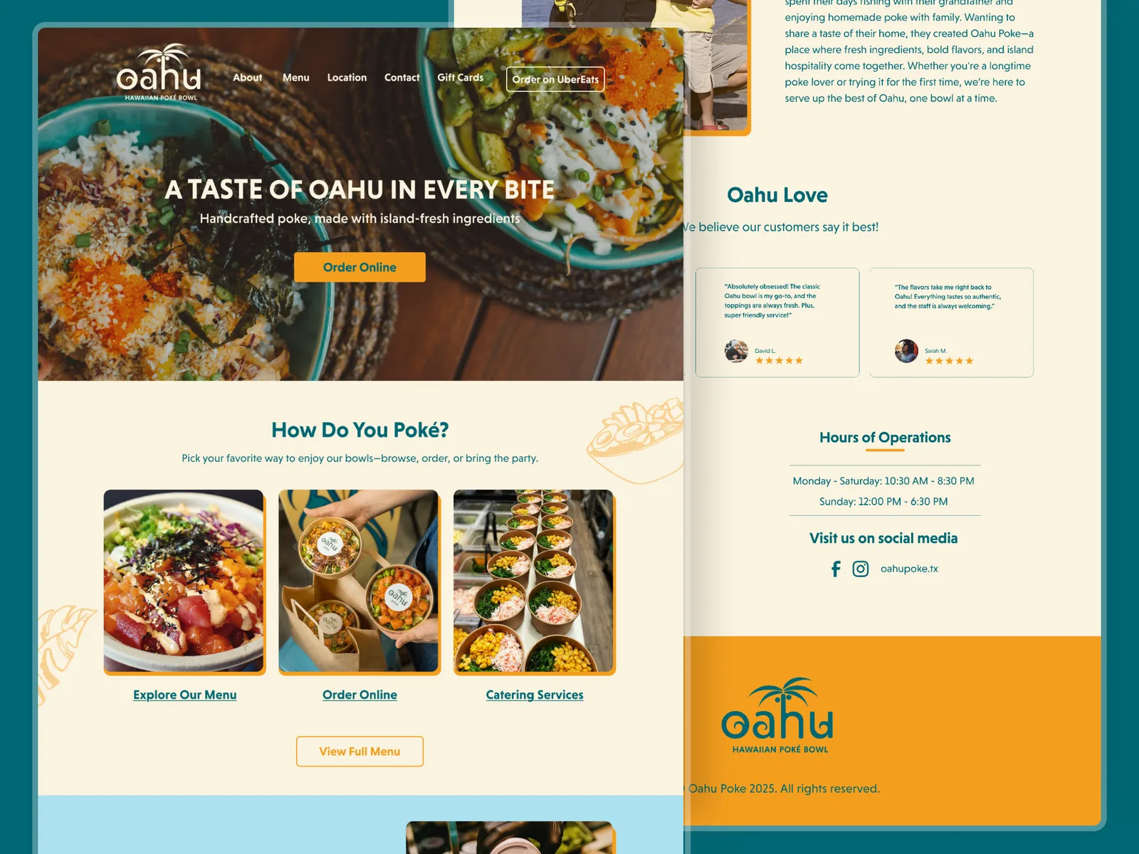
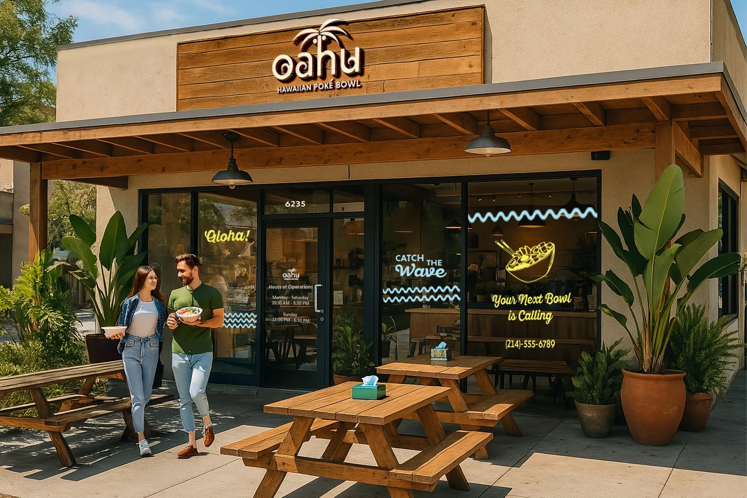
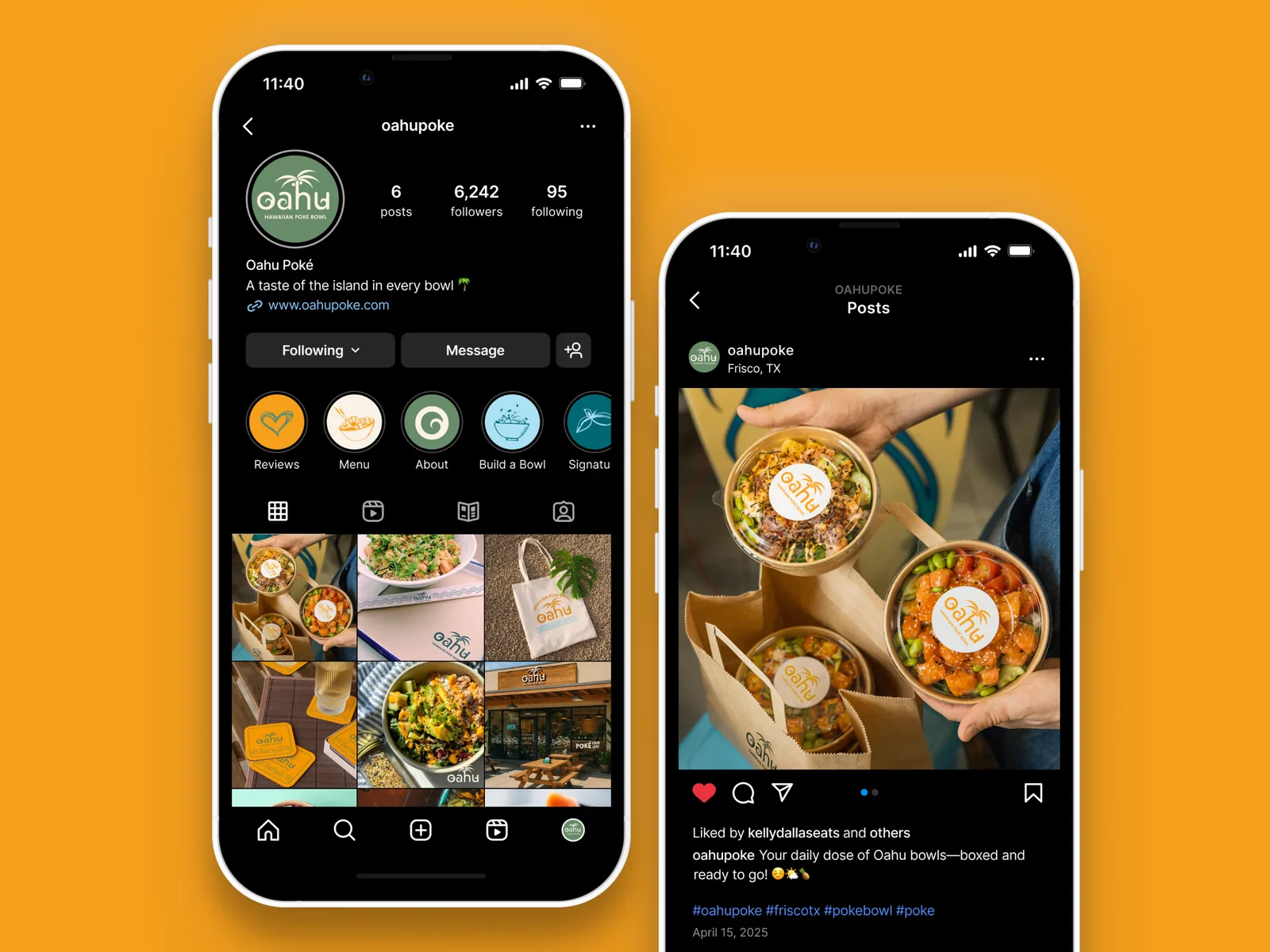
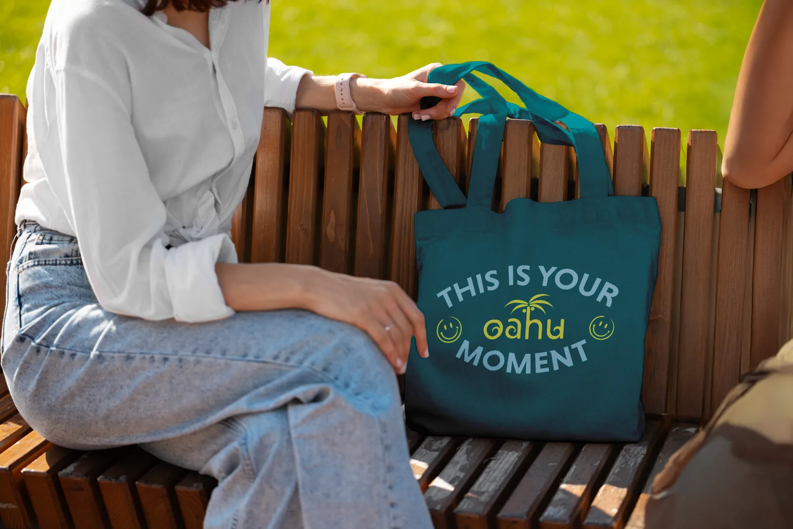
A sunny Hawaiian poke spot, designed end to end: logo, website, social, in-store menu screens, an ordering kiosk and storefront windows.

  • Branding
  • Web
  • Environmental
Oahu Poké website: a taste of Oahu in every bite
Oahu Poké storefront with neon window graphics
Oahu Poké Instagram profile and post
Oahu tote bag: this is your Oahu moment
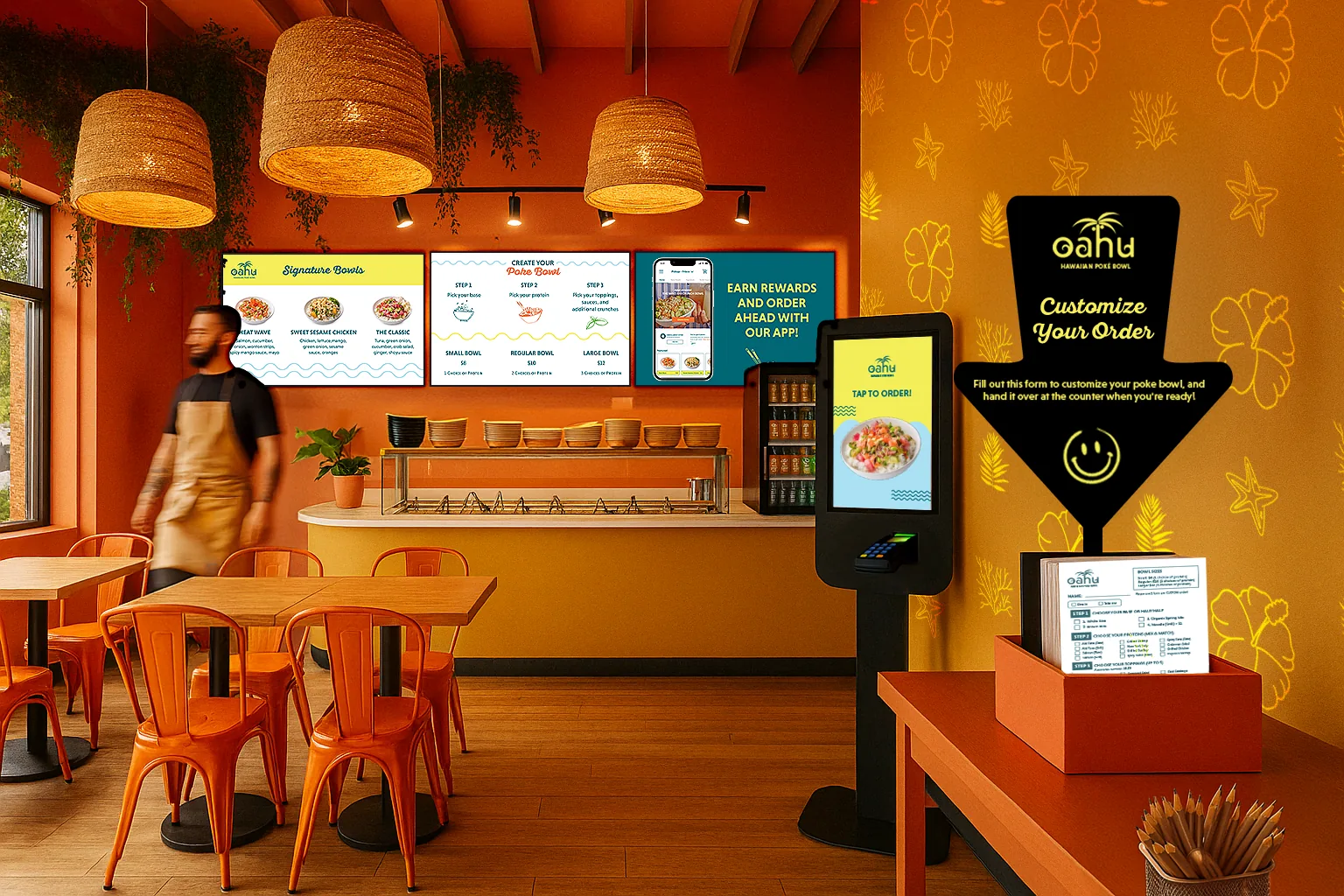
Oahu Poké interior with menu screens, kiosk and order station

More experiments

  • Snuzzle Veterinary CareA coded website for a vet brand.Visit the site ↗
  • Zoniverse BeautyA landing page concept inspired by galaxies.
← All work

Baker Hill · Unify (formerly NextGen)

Giving a lending platform one clear design language

Baker Hill makes loan origination software for community banks and credit unions. Its design pieces were years out of date and never formalized into a system, so every team solved the same problems differently. I helped rebrand NextGen into Unify, rebuild its UI and UX on a shared system, and carry that look into marketing and RISE 2026, Baker Hill's annual lending conference.

Role
Product Designer
Timeline
[Start] – present
Team
Product, engineering, marketing, sales
Tools
Figma, [others]
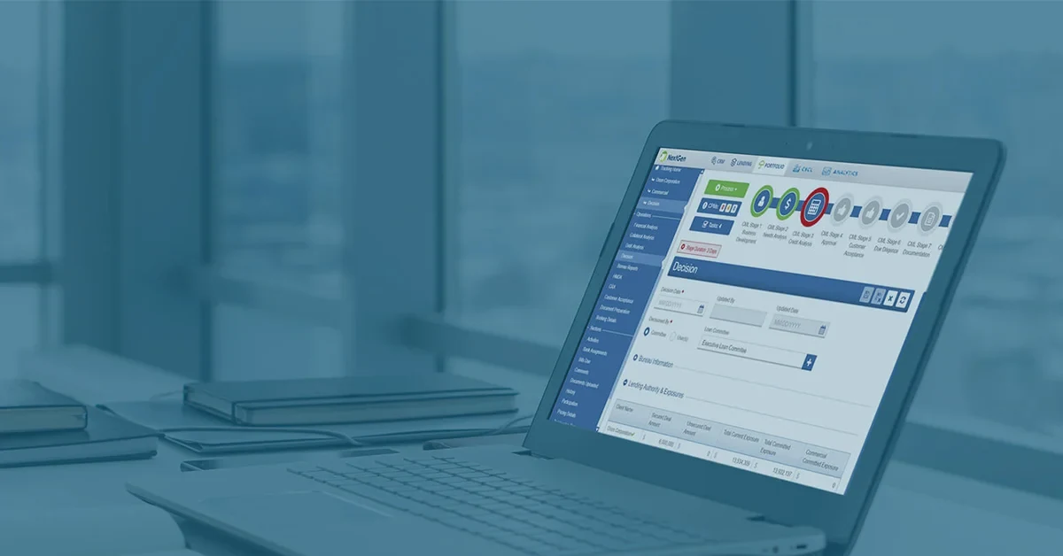
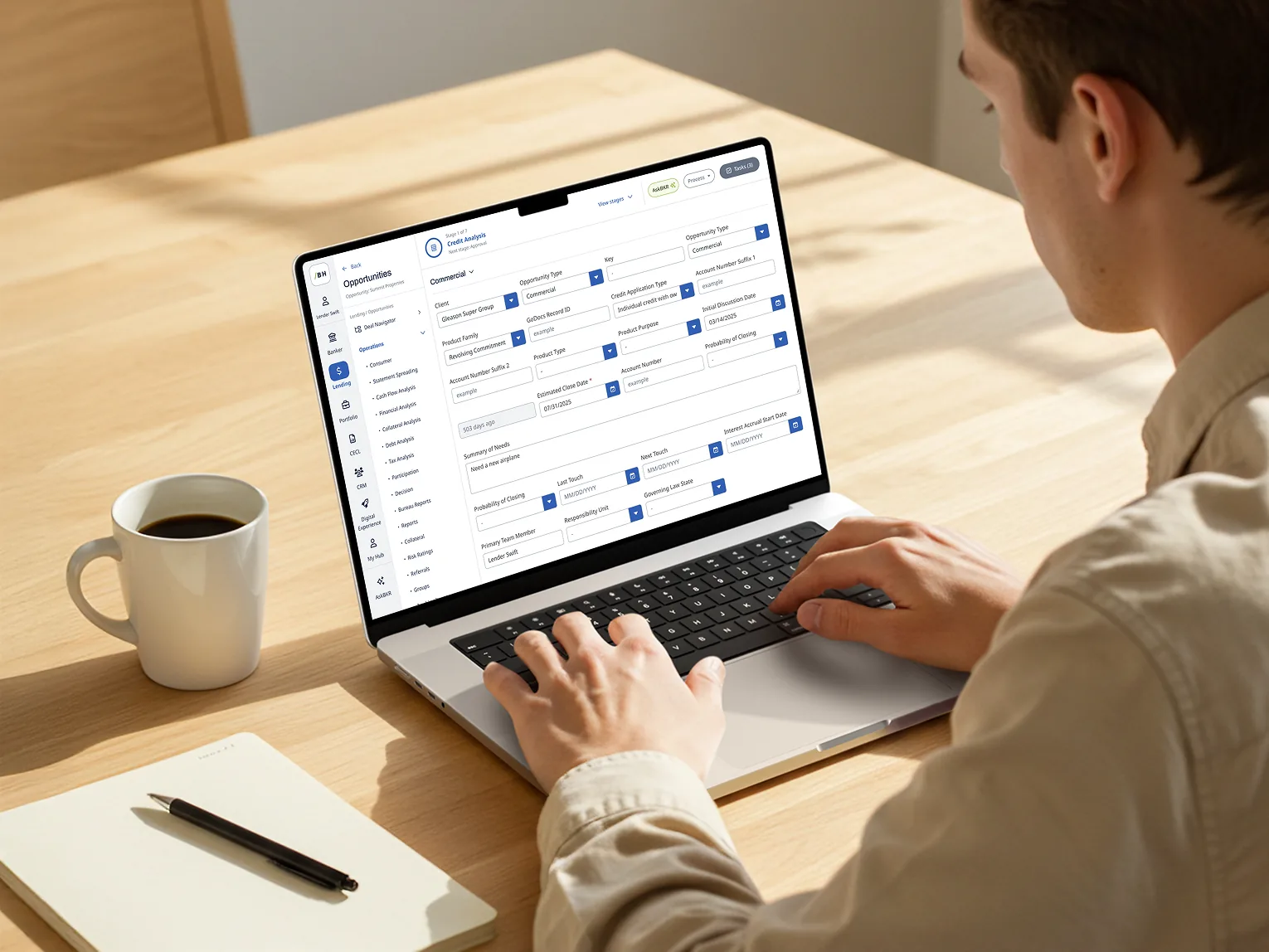
Unify loan origination dashboard on a laptop
The starting point

A system that had fallen behind

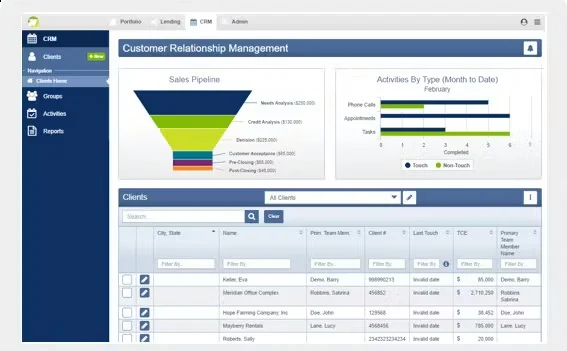
NextGen had grown feature by feature. Screens built years apart used different buttons, tables and spacing, so lenders had to relearn the product every time they moved between steps. The components that did exist were outdated and undocumented, so designers and engineers kept rebuilding the same pieces.

The old NextGen loan decision screen on a laptop
The old NextGen CRM dashboard with a sales funnel and a dense client table

Before: NextGen's loan workflow and CRM.

Rebrand

From NextGen to Unify

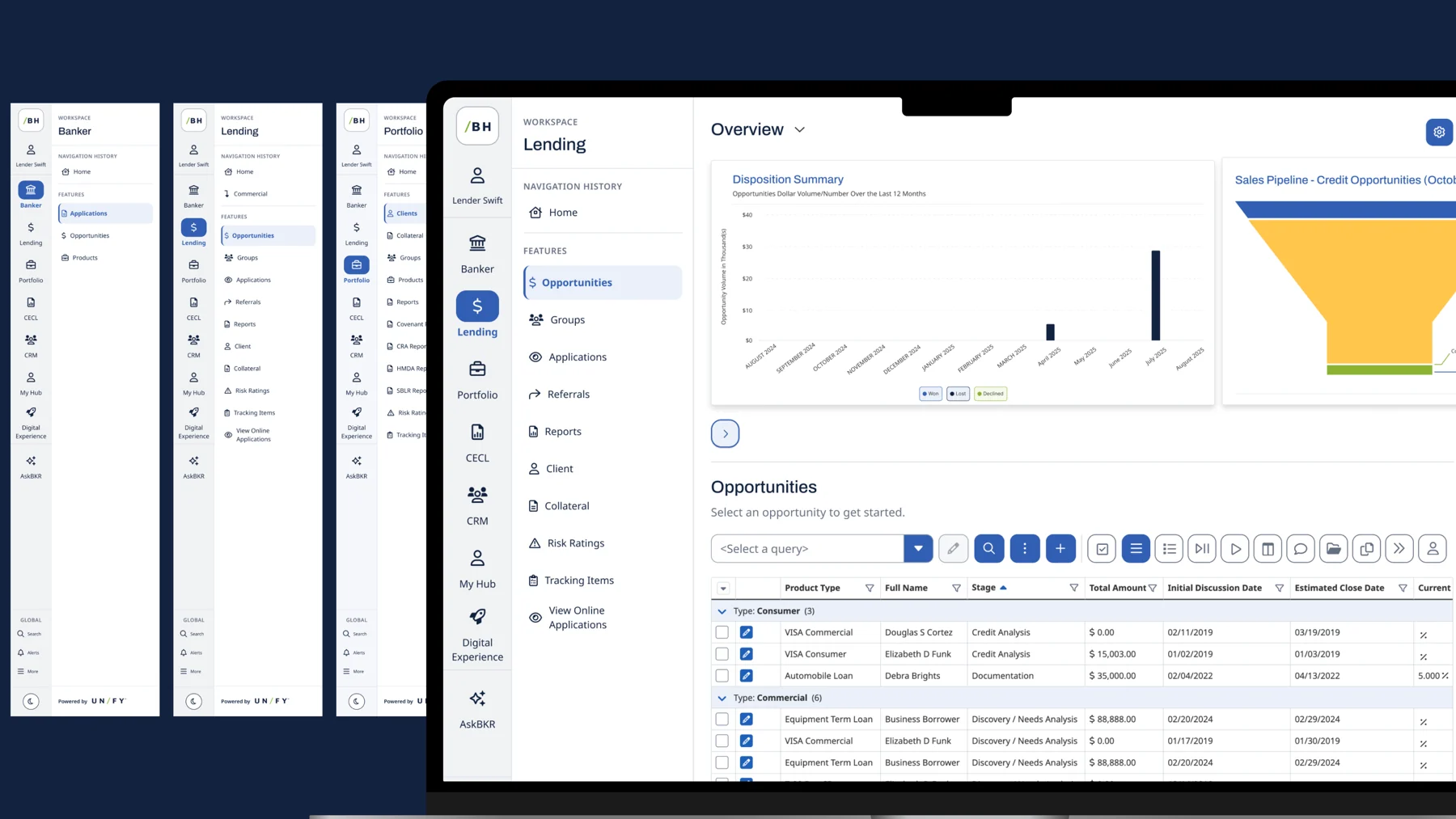
"NextGen" described a moment in time. "Unify" describes the promise: one workflow from application to close. I helped shape the new identity and applied it across the product, social and sales materials so customers saw one brand everywhere.

Unify's new navigation: Banker, Lending and Portfolio workspaces next to the Lending overview on a laptop
Social media

The new look, in people's feeds

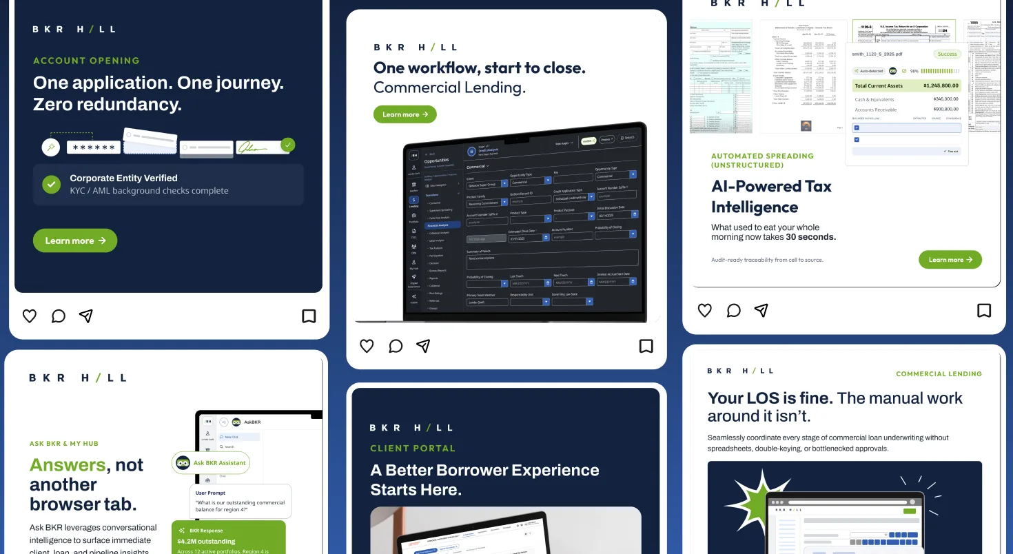
I also design Baker Hill's social graphics, so the brand shows up the same way in a LinkedIn feed as it does in the product.

Baker Hill social media graphics
Design system

One set of parts for dense lending data

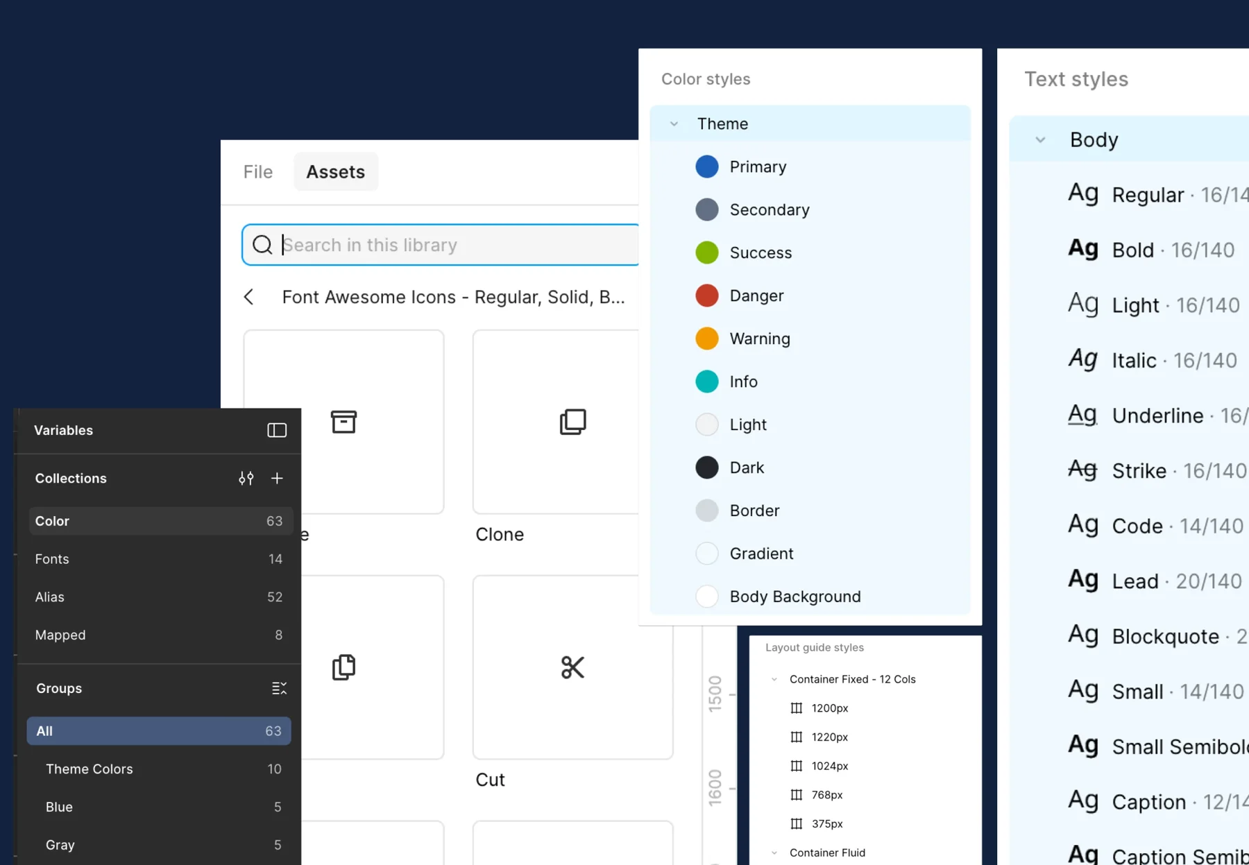
Loan origination is tables, long forms and status at every step. I built the shared foundations first (color and type variables, text styles and a 12-column grid), then the components lenders touch most: data tables, form fields, filters and status chips. Now new features start from one up-to-date system instead of old one-off screens.

Unify Figma library: color and font variables, theme color styles, text styles, an icon set and 12-column layout grids
UI + UX overhaul

Clearer screens, on every device

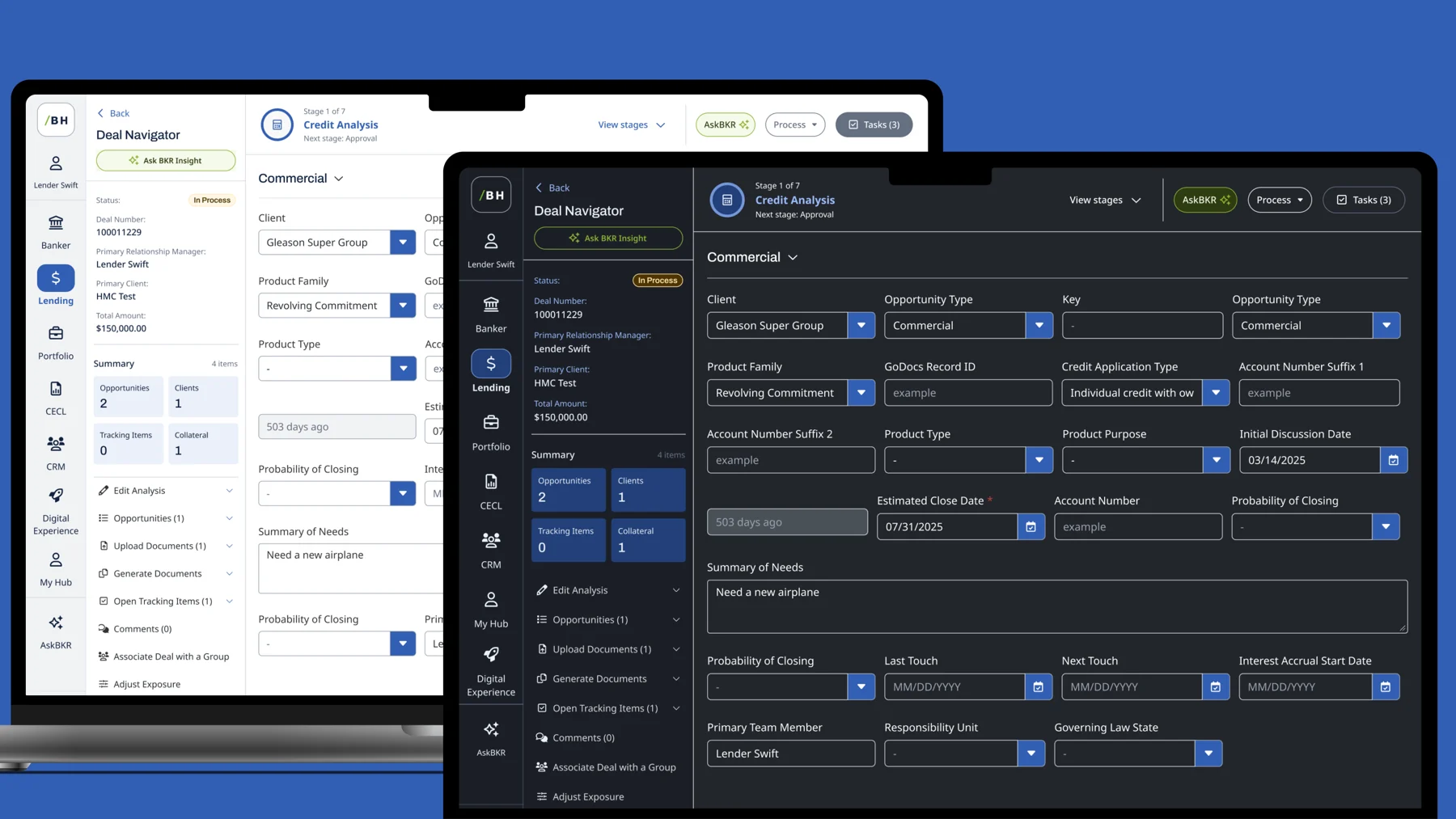
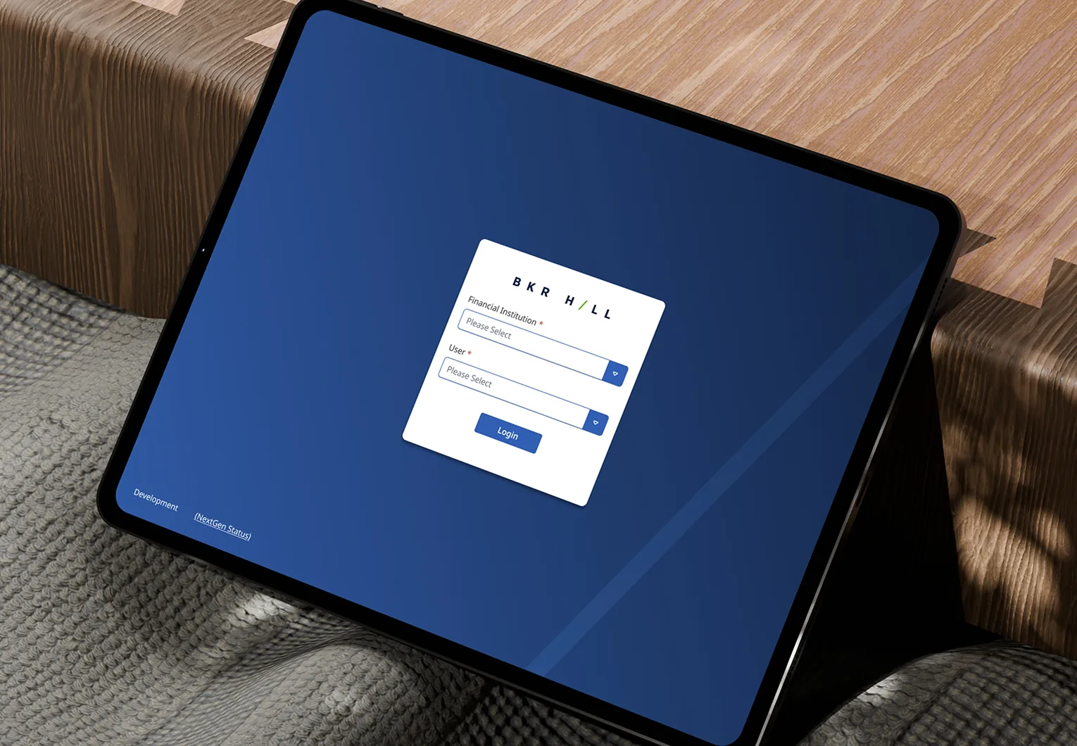
With the system in place, I redesigned core flows like opportunities and the loan application so the next action is always obvious. Light and dark themes, plus tablet and mobile layouts, let loan officers work the way they already do: at a desk, in a branch or with a borrower.

The Deal Navigator credit analysis screen in light and dark mode
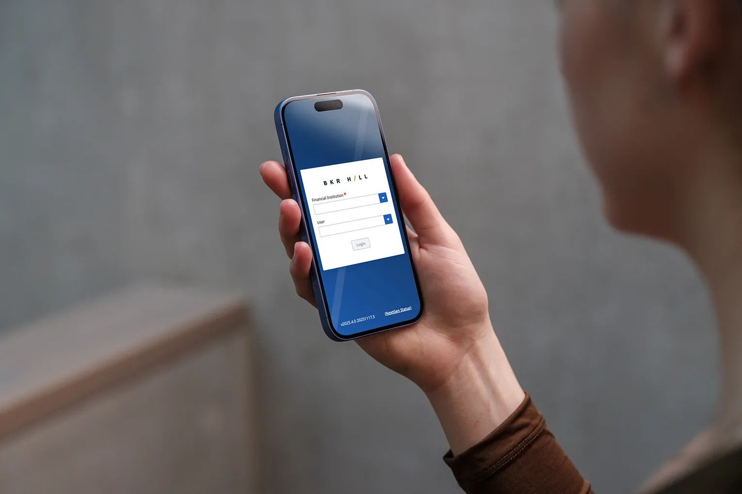
Unify sign-in on a tablet
Unify sign-in on a phone
Cross-team features

AskBKR: answers without leaving the workflow

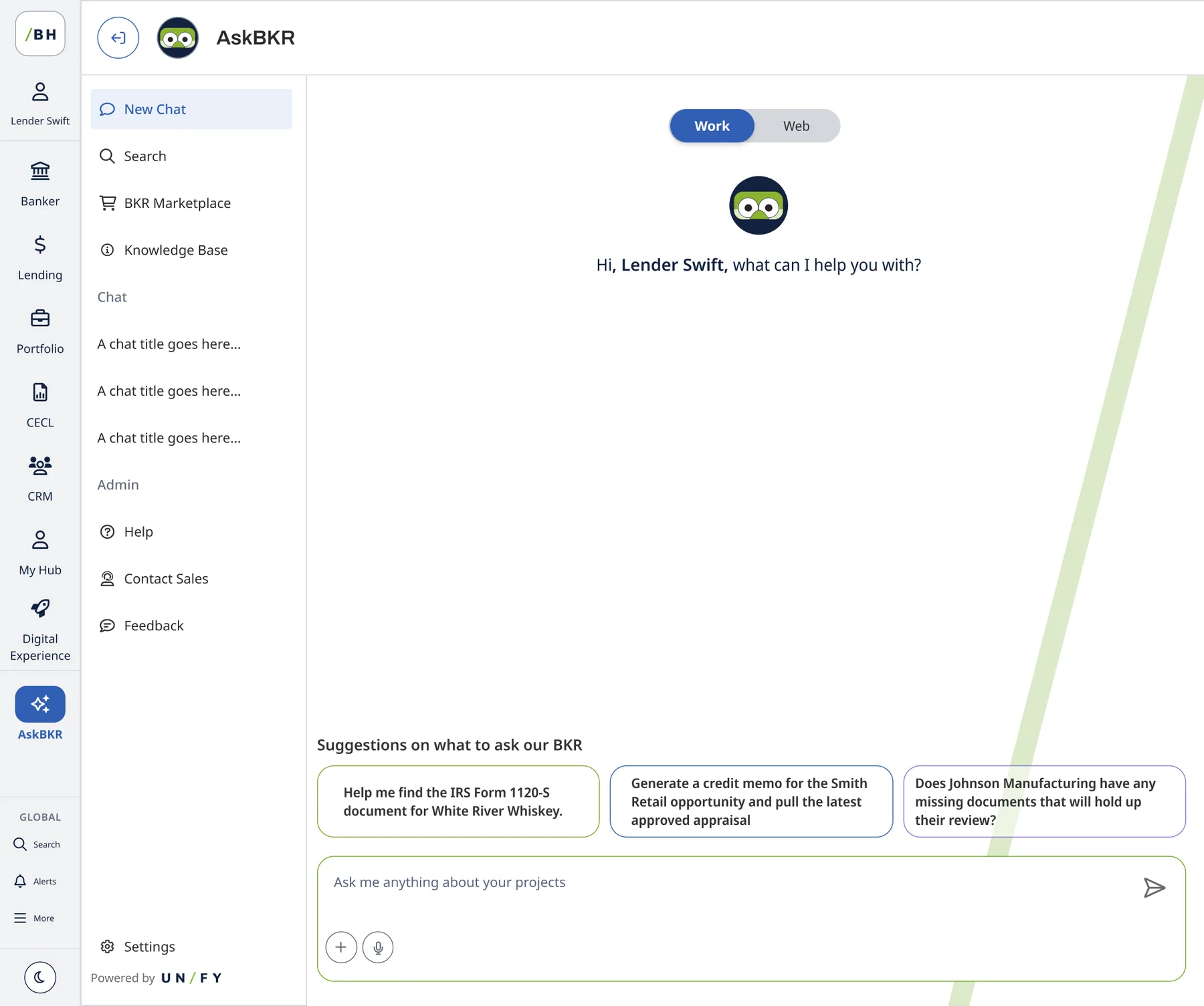
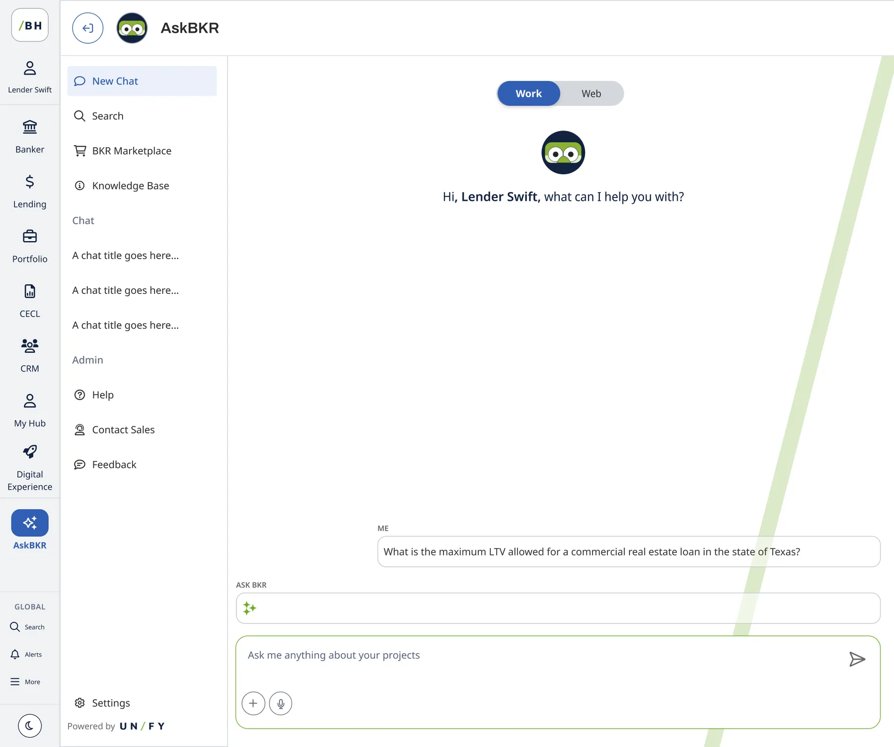
I partnered with product and engineering on features across the platform. One was AskBKR, an AI assistant built into Unify, so lenders can ask about a policy or a loan without opening another tool. Suggested prompts help first-time users know what to ask.

AskBKR assistant with suggested prompts
AskBKR conversation
RISE 2026

Bringing it to the customers

RISE is Baker Hill's annual lending conference. I worked with marketing, sales and product to design the event's experience and materials around the new Unify story. The result: more deals won and a strong NPS from attendees.

Add the numbers and photos. NPS score, deals influenced, attendance, plus 2–3 event photos or slides. Numbers here are what recruiters remember.
What I learned

A system is a team habit, not a file

Add a reflection. One trade-off you made (for example, which components you shipped first and why) and what you'd do next.
← All work

Rally · iOS app · 2024

Turning the urge to volunteer into a booked shift

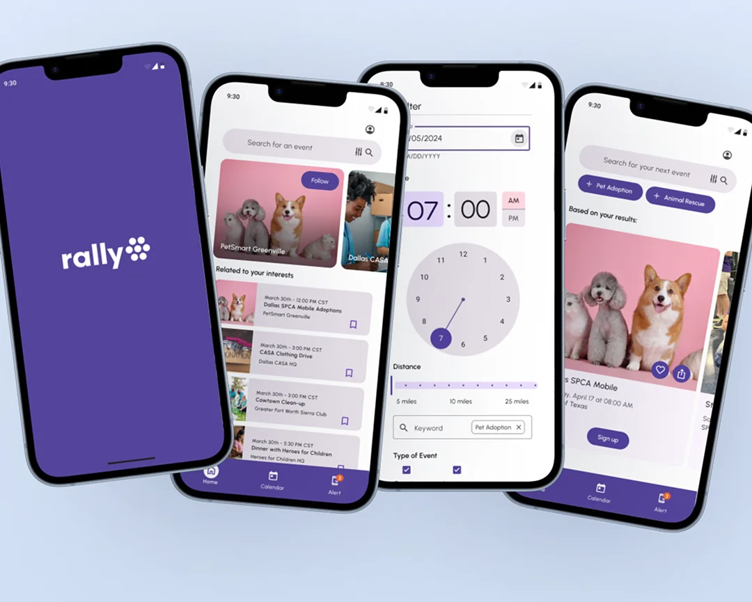
Rally helps people in Dallas–Fort Worth find and schedule local volunteering. Existing sites list opportunities but leave out the logistics busy people need before committing, so I led a mobile design built around at-a-glance details and one-tap booking.

Role
Lead Product Designer
Timeline
Design sprint, Jan – Apr 2024
Team
Emma Wilkie (PM), Bri Castillo, Savannah Georgecink, Nhi Vo (Product), Morgan Goerke (Visual)
Tools
Figma, Adobe Illustrator
Rally home, filter and event screens on three phones
The problem

People want to help. Then they don't sign up.

There's a large gap between intending to volunteer and actually doing it. Current platforms work like bulletin boards and lack the scheduling busy professionals need to commit with confidence.

  • Business need: centralize opportunities to raise community engagement and reduce friction for local nonprofits.
  • User need: clear, at-a-glance schedules and requirements so intent becomes action.
Research

The barrier was uncertainty, not interest

50–70%of volunteers quit within their first year

We paired industry data on the $3.7B volunteer management market with small, deep-dive interviews. People dropped off when a listing didn't say how long it would take or what to expect on the day: parking, gear, tasks.

So every opportunity card answers who, what, where and when at a glance.

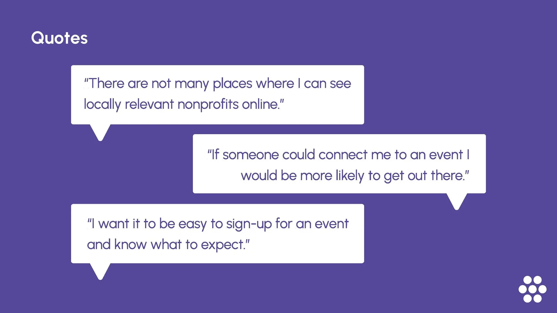
Interview quotes about finding local volunteer events
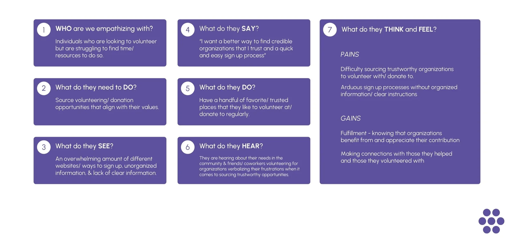
Empathy map: what volunteers say, do, think and feel
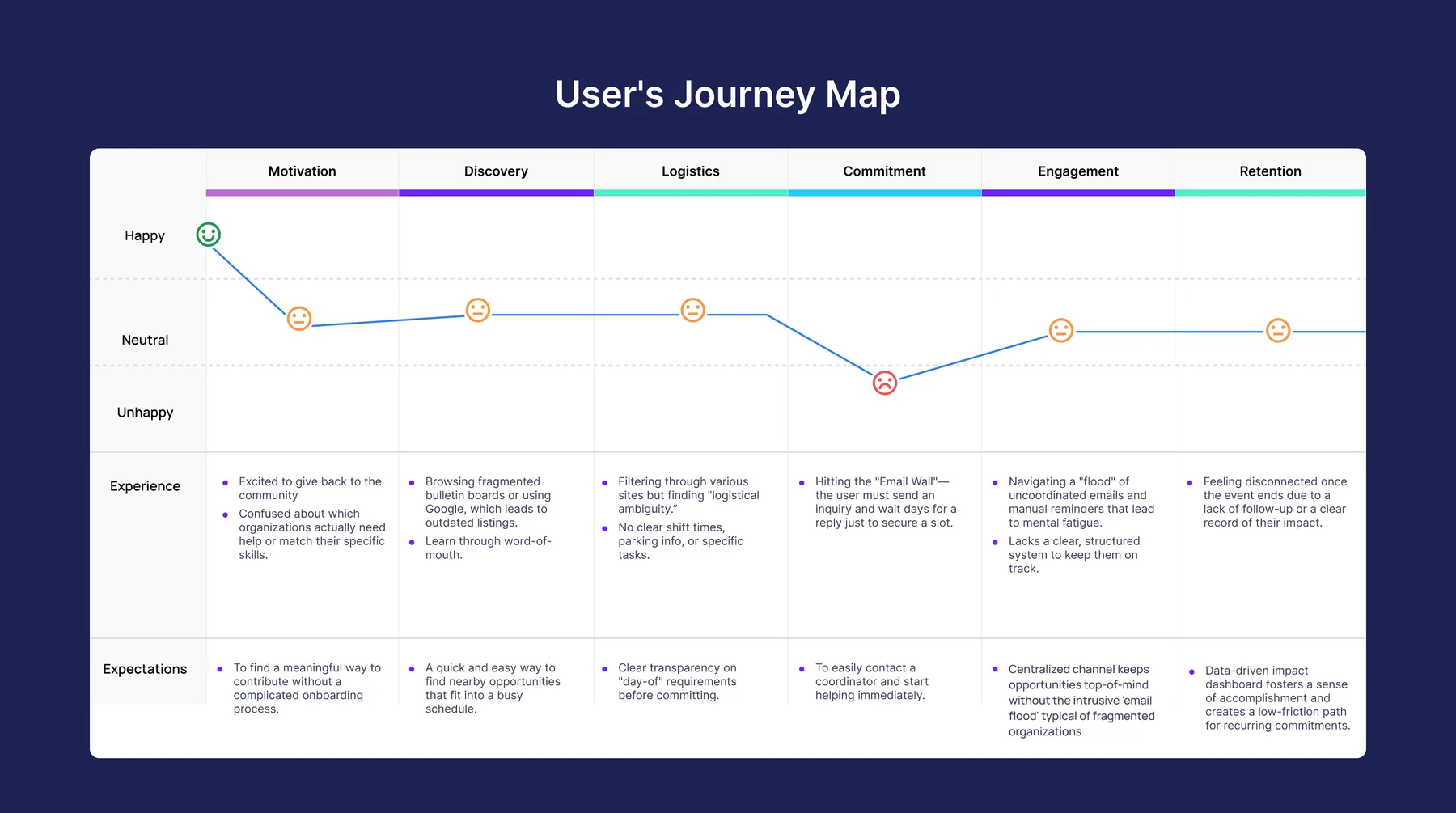
Volunteer journey map from motivation to retention, with a dip at logistics
Competitors

Big databases, then an "email wall"

Platforms like VolunteerMatch have huge nonprofit databases but favor quantity over clarity. Signing up usually means manual email back-and-forth, which turns a quick yes into a multi-day wait.

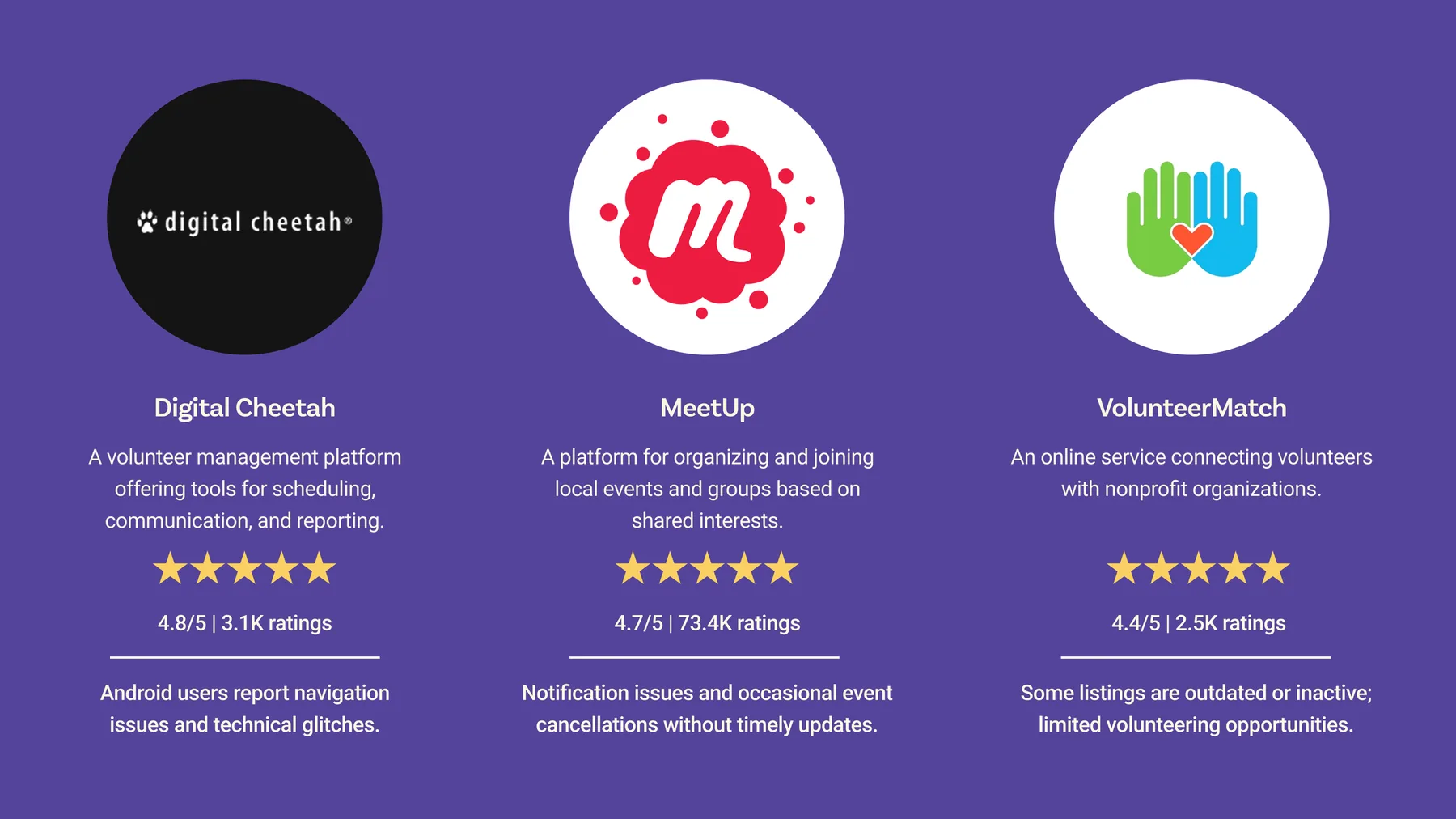
Digital Cheetah, MeetUp and VolunteerMatch compared, with ratings and pain points
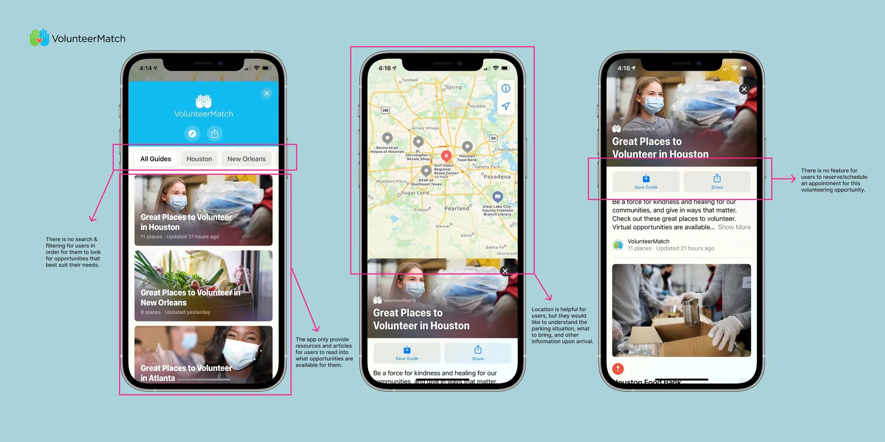
VolunteerMatch app screens annotated with friction points
How might we help Dallas residents understand what local shelters need, and make volunteering or donating feel seamless?
Process

Must-know details first

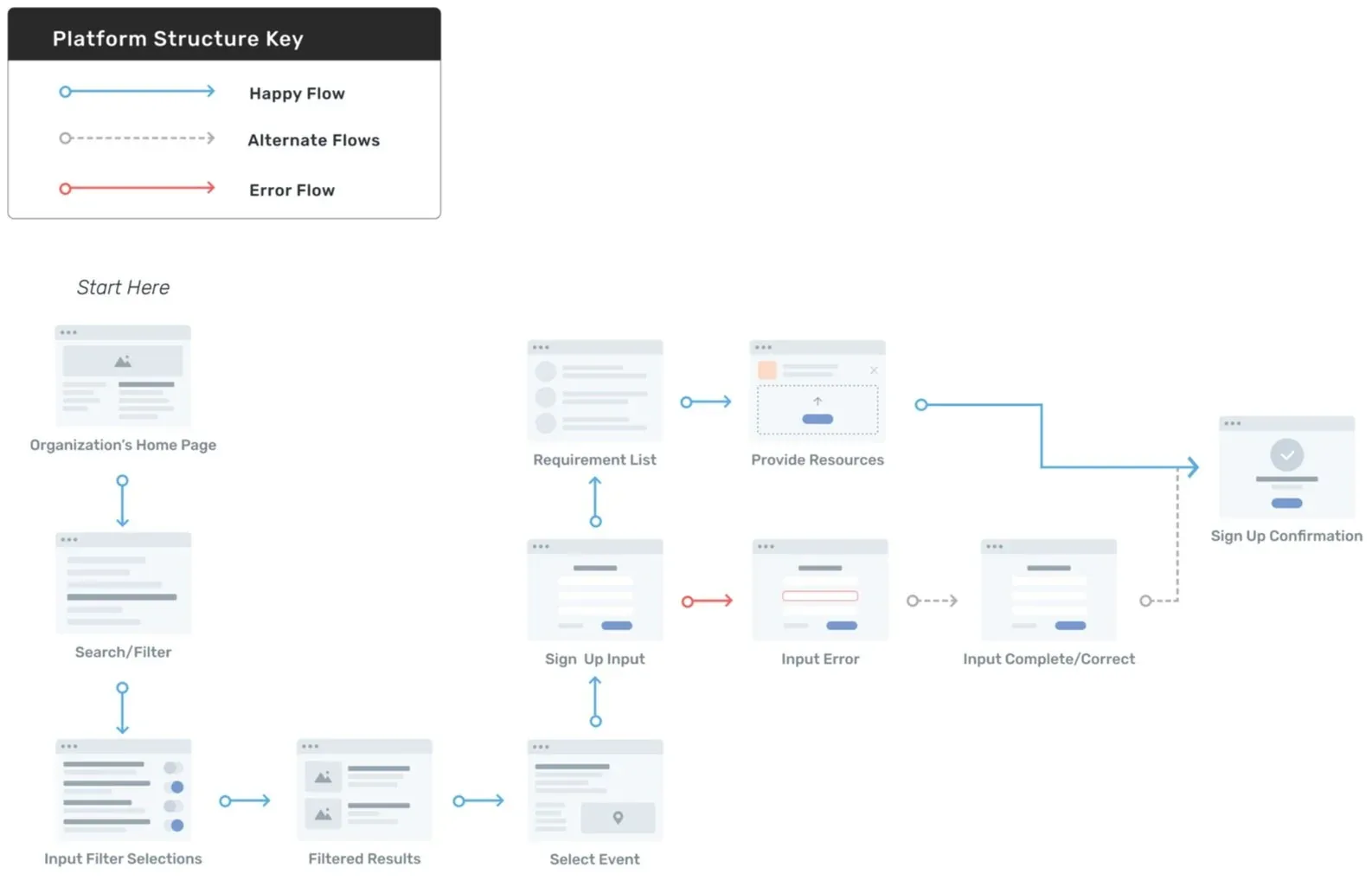
The user flow puts parking, attire and task descriptions up front, cutting the back-and-forth that causes drop-off. Volunteers reach "Commit" already knowing what they're signing up for.

User flow with happy, alternate and error paths through sign-up

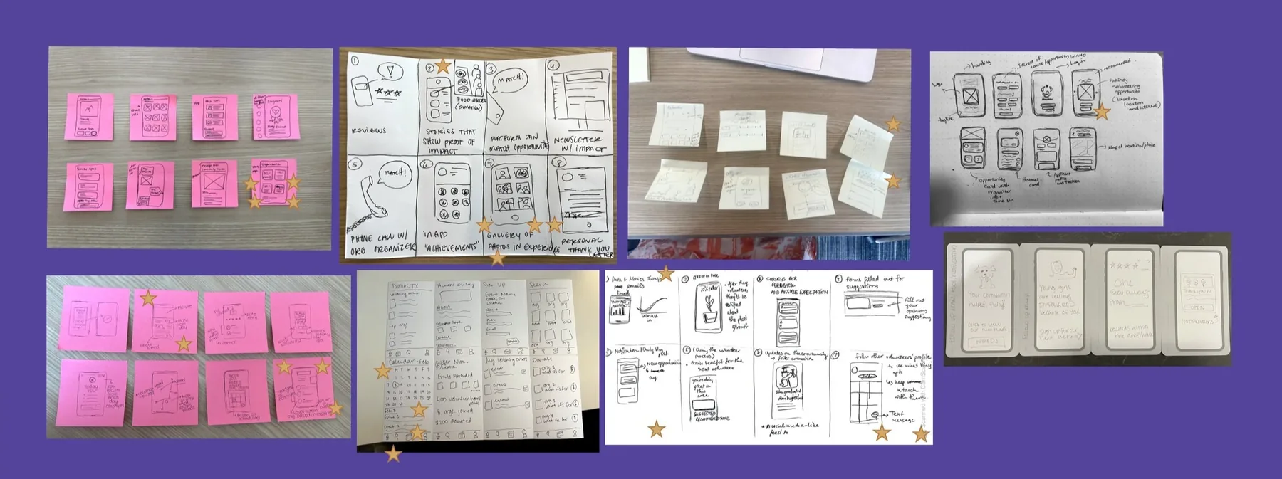
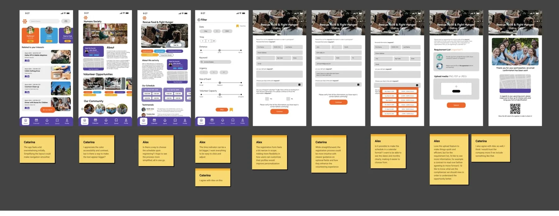
We sketched fast, with everyone contributing ideas in short rounds, then moved to mid-fidelity so senior designers and developers could react early. Testing logistics-heavy layouts as functional mocks let us refine navigation in real time.

Paper sketches and sticky-note rounds
Low-fidelity screens with feedback notes
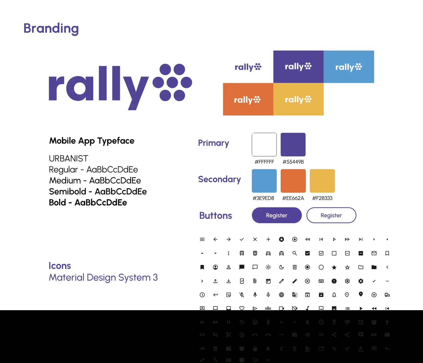
Rally branding: logo, Urbanist type, purple palette, buttons and Material icons
The solution

From discovery to day-of, in one place

  • Curated feed. Opportunities ranked by your interests, location and real-time urgency.
  • Advanced filters. Narrow by skill, cause and availability.
  • One-tap booking. Secure a shift without the email wall.
Curated feed
Filters
One-tap booking
Outcome

A directory became a retention tool

Reviewers rated the final designs highly for reducing friction and bringing clarity to a cluttered space. Solving the email wall and surfacing logistics up front turned a fragmented, manual process into one that respects volunteers' time.

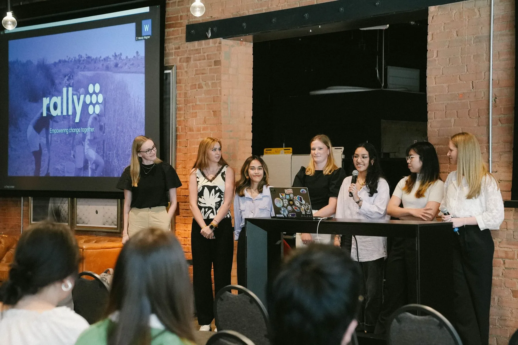
The Rally team presenting final designs on stage
Add a reflection. One thing you'd do differently, or one trade-off you made and why. Hiring managers read this part closely.
← All work

GOBankingRates · 2024

Making money advice feel approachable on social

GOBankingRates shares financial advice, tips and stories. I helped strengthen its brand presence and build a social strategy that paired engaging visuals with relatable money insights.

Role
Design Assistant Intern
Timeline
May – Oct 2024
Team
Design, Marketing, Social Media
Tools
Figma, Meta Business Suite
53%more audience reach
84K+impressions
50%higher story engagement
Strategy

How do we connect more closely with followers?

I set up a tight feedback loop with the social leads and co-created content pillars in FigJam. Then I turned audience insights into flexible templates that stayed on-brand but could react quickly to money news.

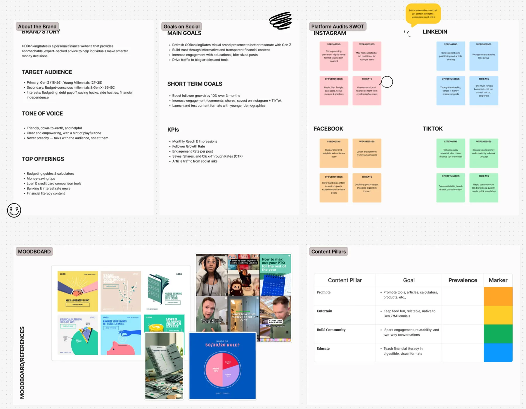
Brand, goals and content pillars mapped in FigJam
Gameplan

Let the data pick the formats

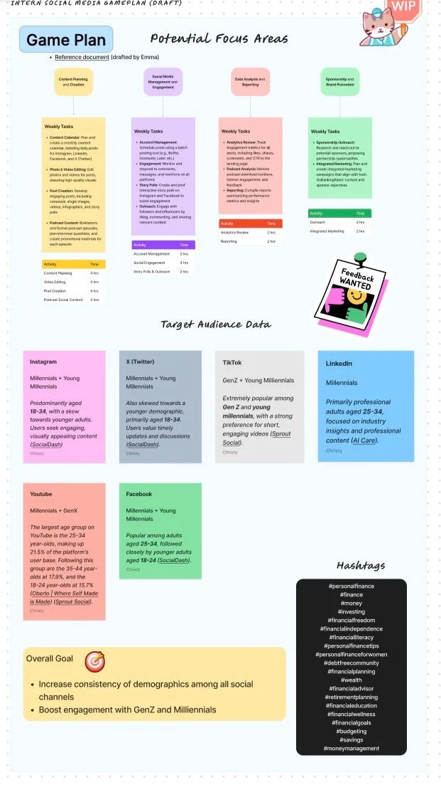
We studied how our audience behaved and which posts performed, to find the visual formats that resonated. I helped build a content calendar that kept design and social output steady.

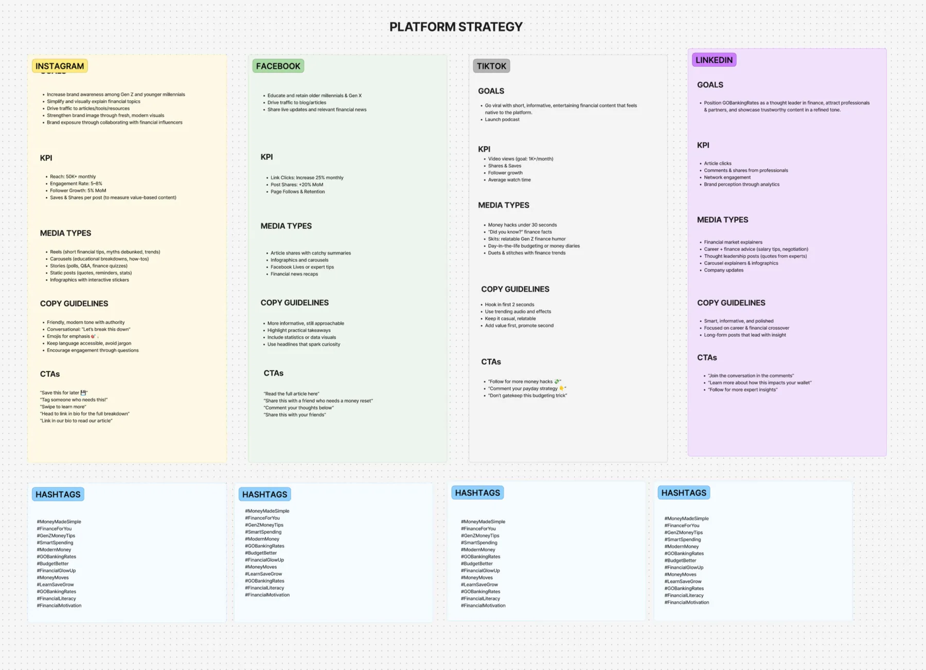
Platform strategy board
Content calendar game plan
Design

Visualizing financial life stages

I made custom icons, type hierarchies and chart styles that felt authoritative but friendly.

  • Actionable advice. High-contrast "Daily Tips" layouts that stay legible on small phones.
  • Data storytelling. Simplified charts that make market trends easy to digest.
  • Human-centric. Photography that reflects the community's different life stages.
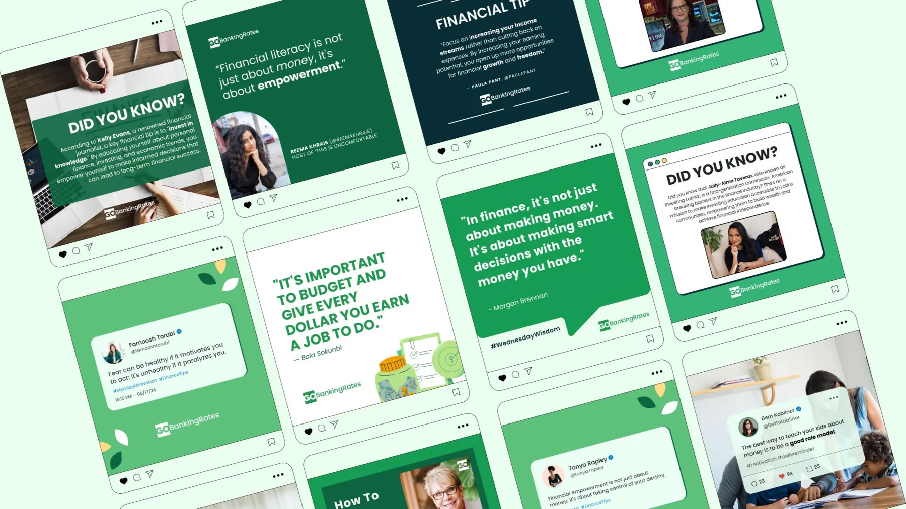
Daily tips and quote posts for Instagram
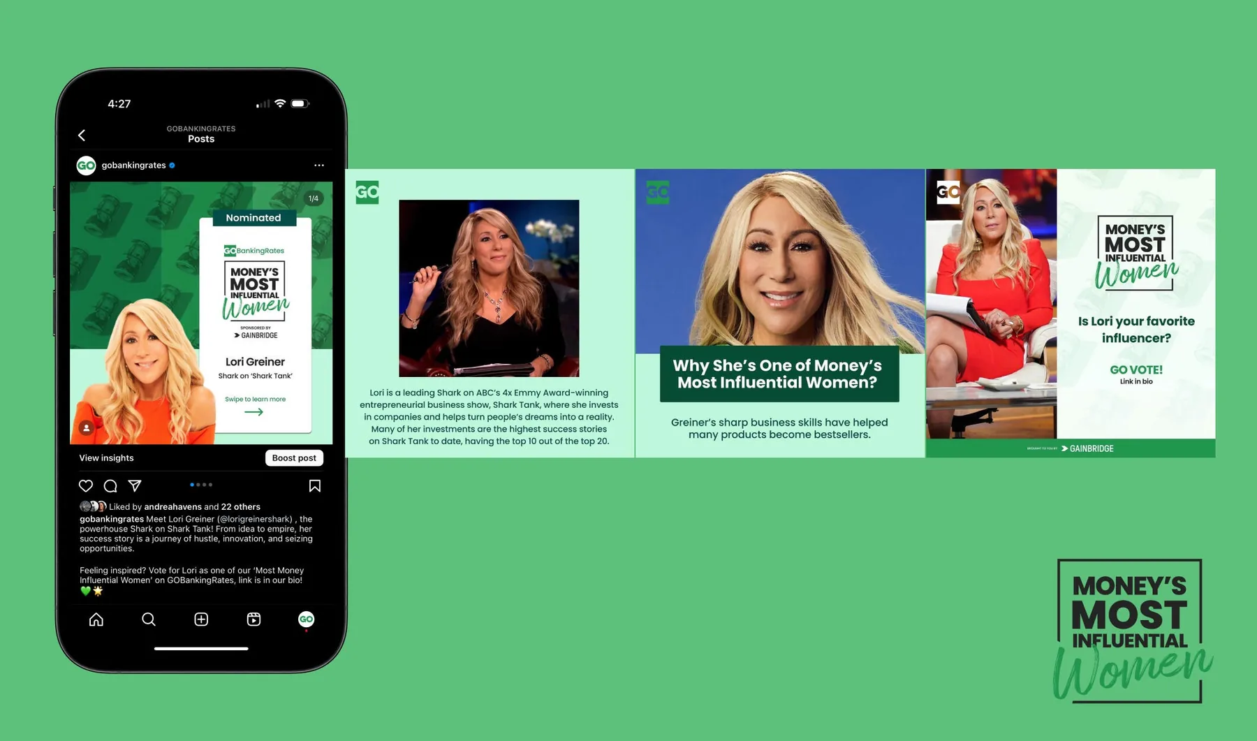
Money's Most Influential Women series
Podcast

"What the Why": from one-way content to a conversation

Listeners send in money questions that the hosts answer live. I designed the podcast's landing page around discovery and conversion, so people can listen, subscribe and submit a question in one place, and kept it consistent across social.

See the live page

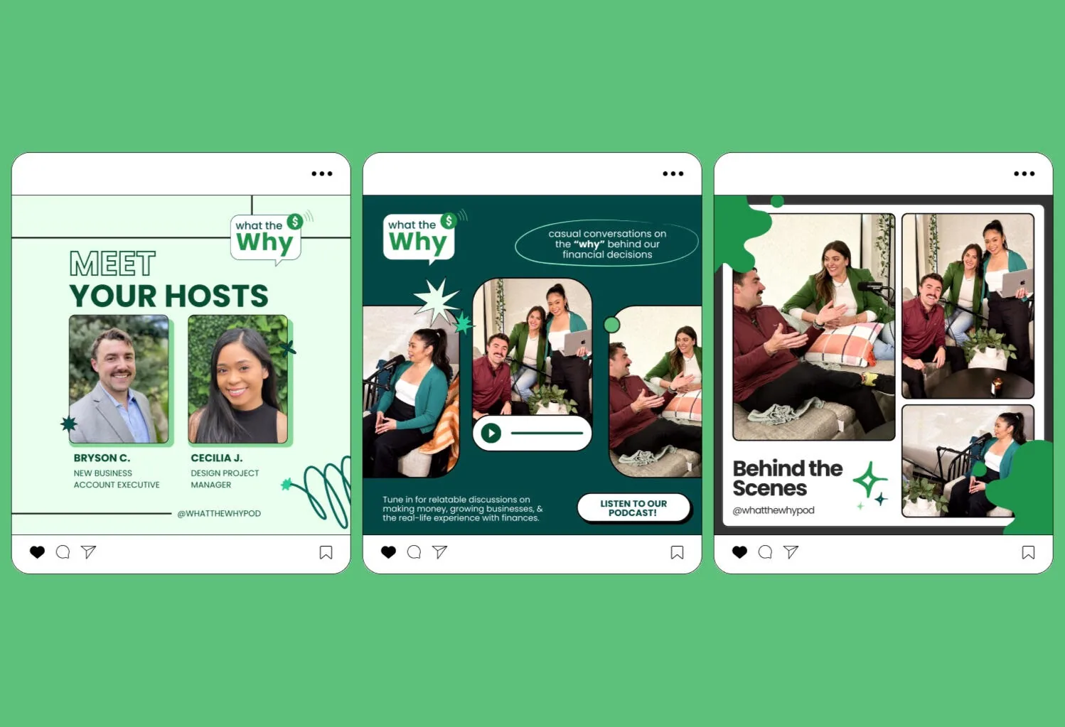
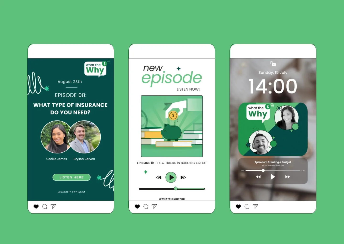
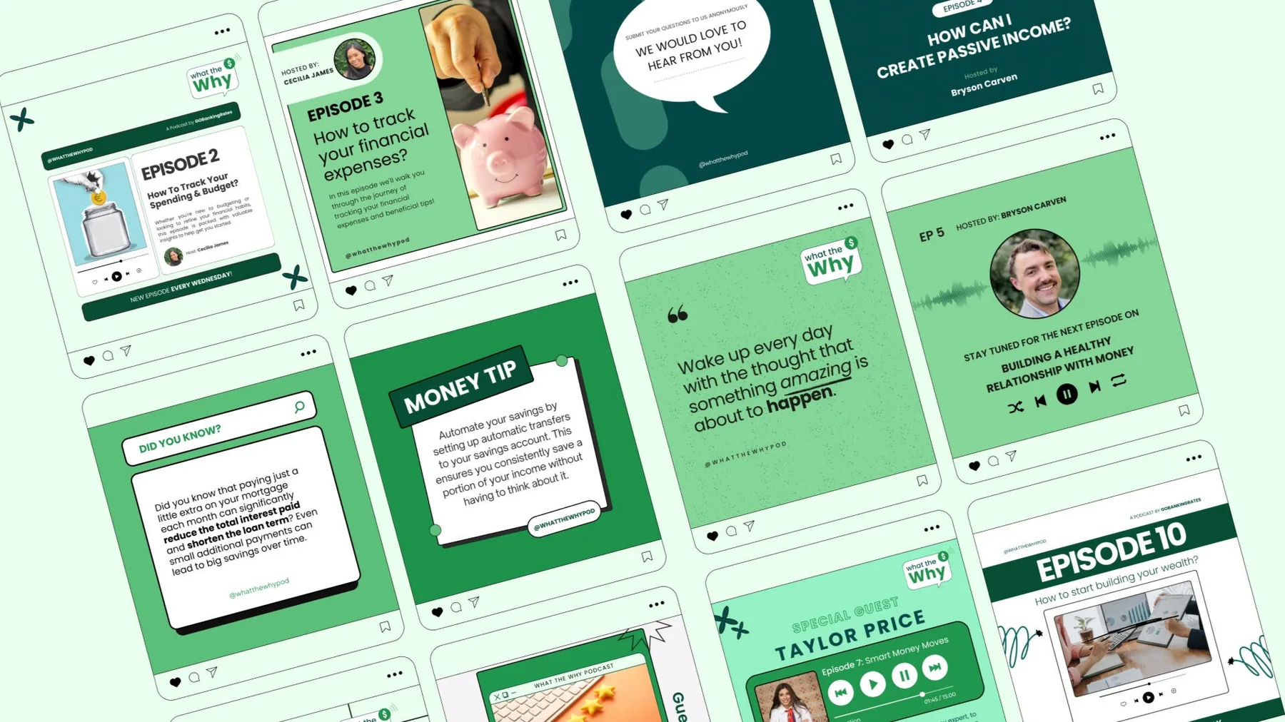
I also built Instagram templates from the brand's core elements, so the social team could turn episode highlights and guest quotes into short-form posts quickly.

Meet your hosts carousel
Episode announcement stories
Episode quote posts
← All work

Chatbooks · 2024

Getting family photos off phones and into books

People take thousands of photos that never leave their phones. Working within Chatbooks' brand guidelines, I made social content and ads that show how easy it is to keep family stories.

Role
Graphic Design Intern
Timeline
Jan – May 2024
Team
Design, Marketing, Social, Paid Media & Performance
Tools
Illustrator, Photoshop, After Effects, Figma
30%more brand presence
40%higher engagement rate
35%more story engagement
Paid + in-feed

Ads that feel like memories

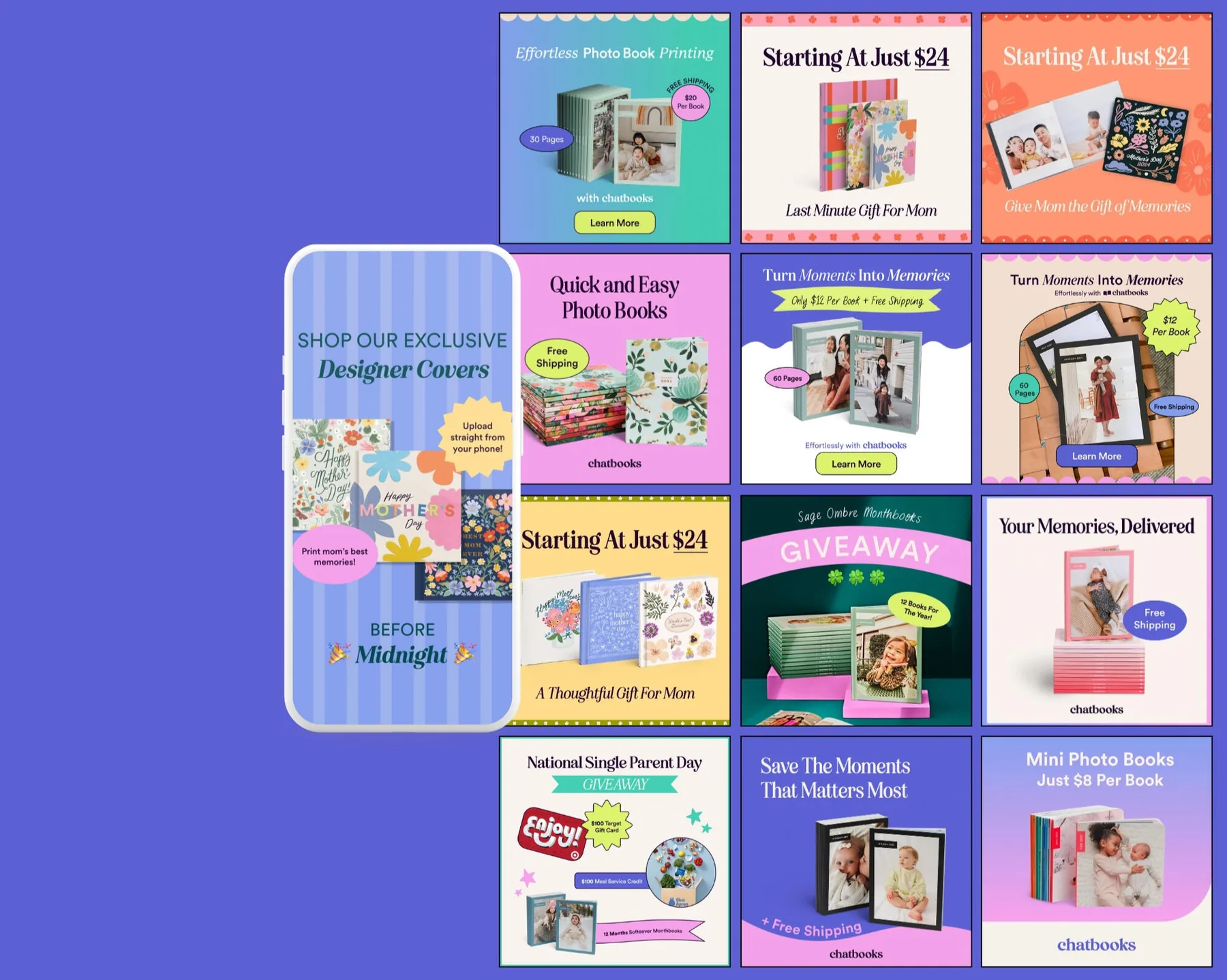
With the creative, social and marketing teams, I designed paid ads for Instagram, Facebook and Google alongside organic posts promoting Chatbooks' photo books, all within the brand's identity.

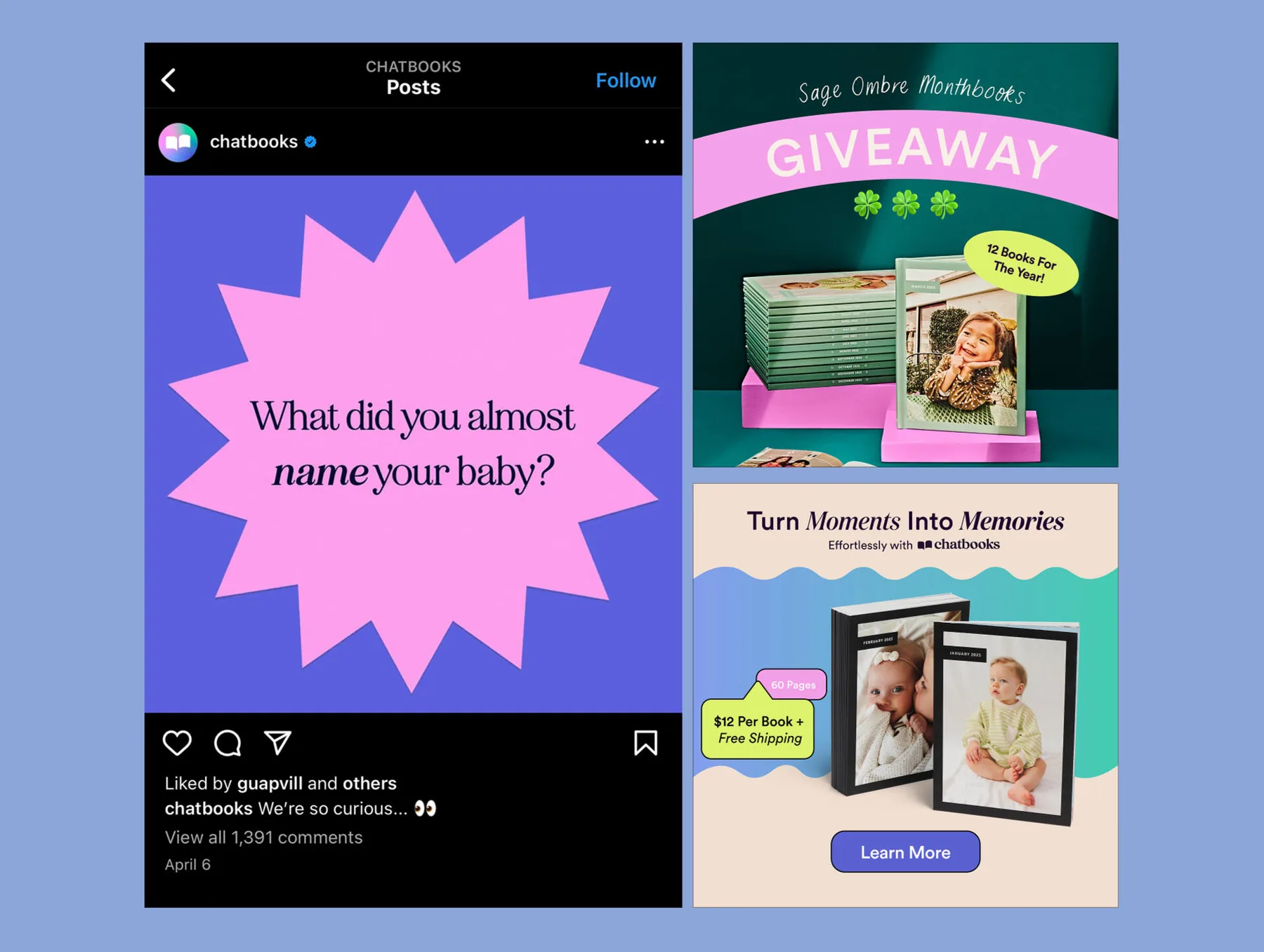
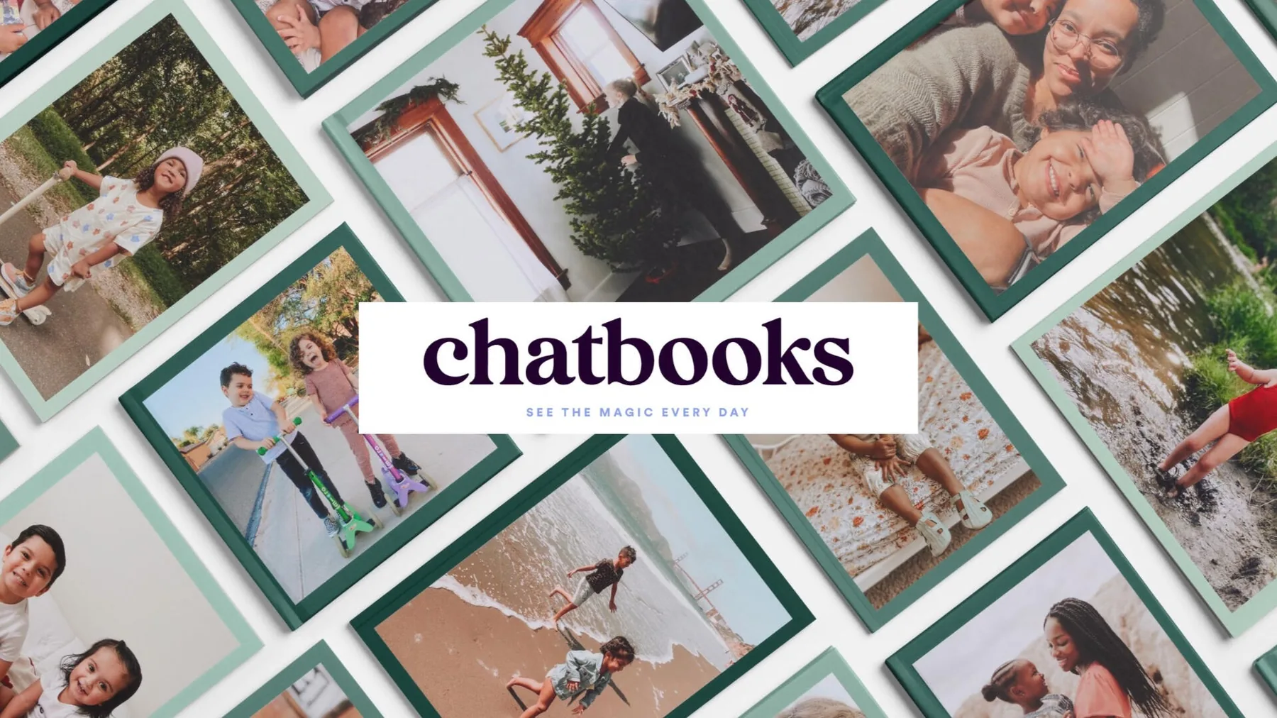
Grid of Chatbooks ads and in-feed posts
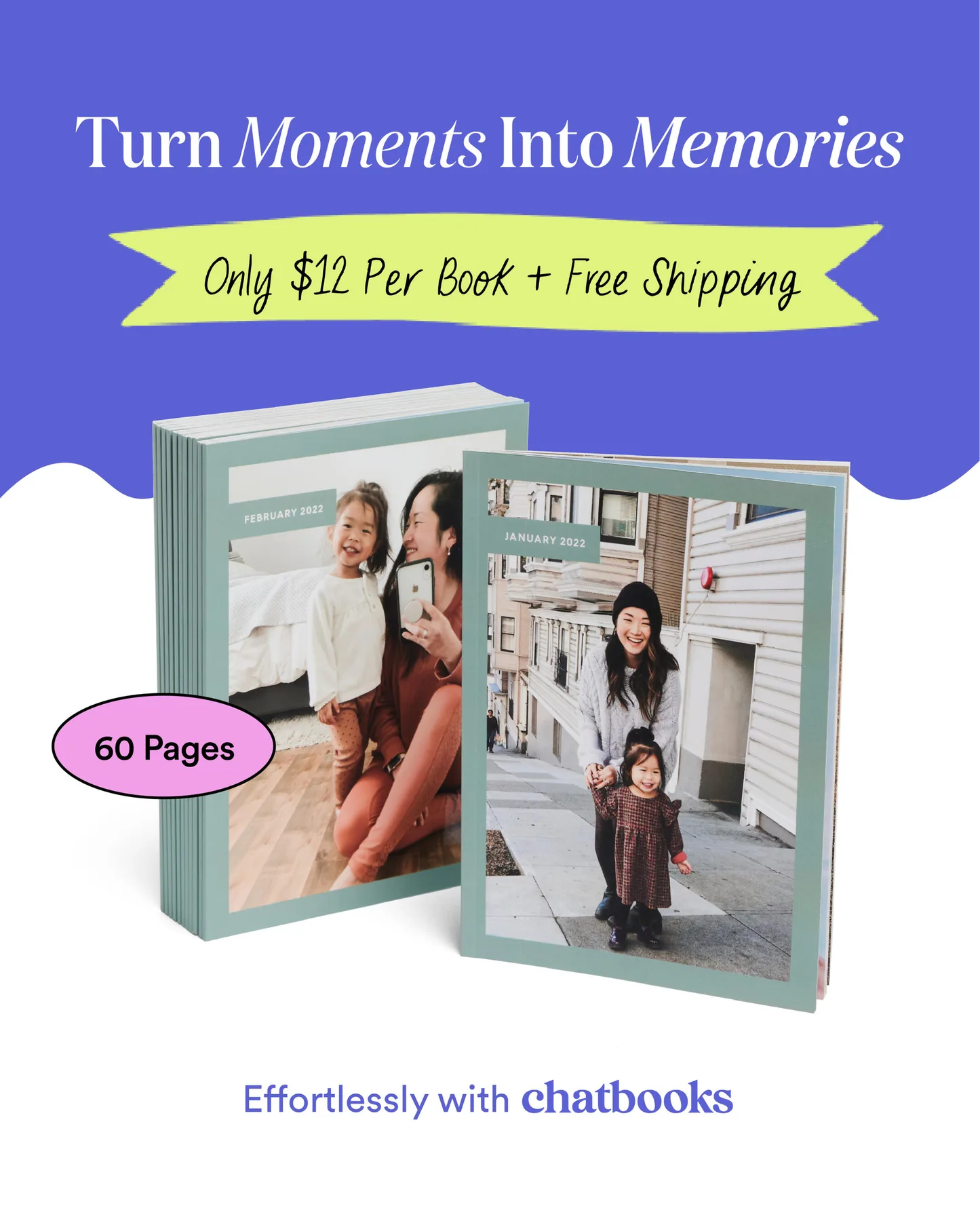
Turn moments into memories ad
Giveaway and engagement posts
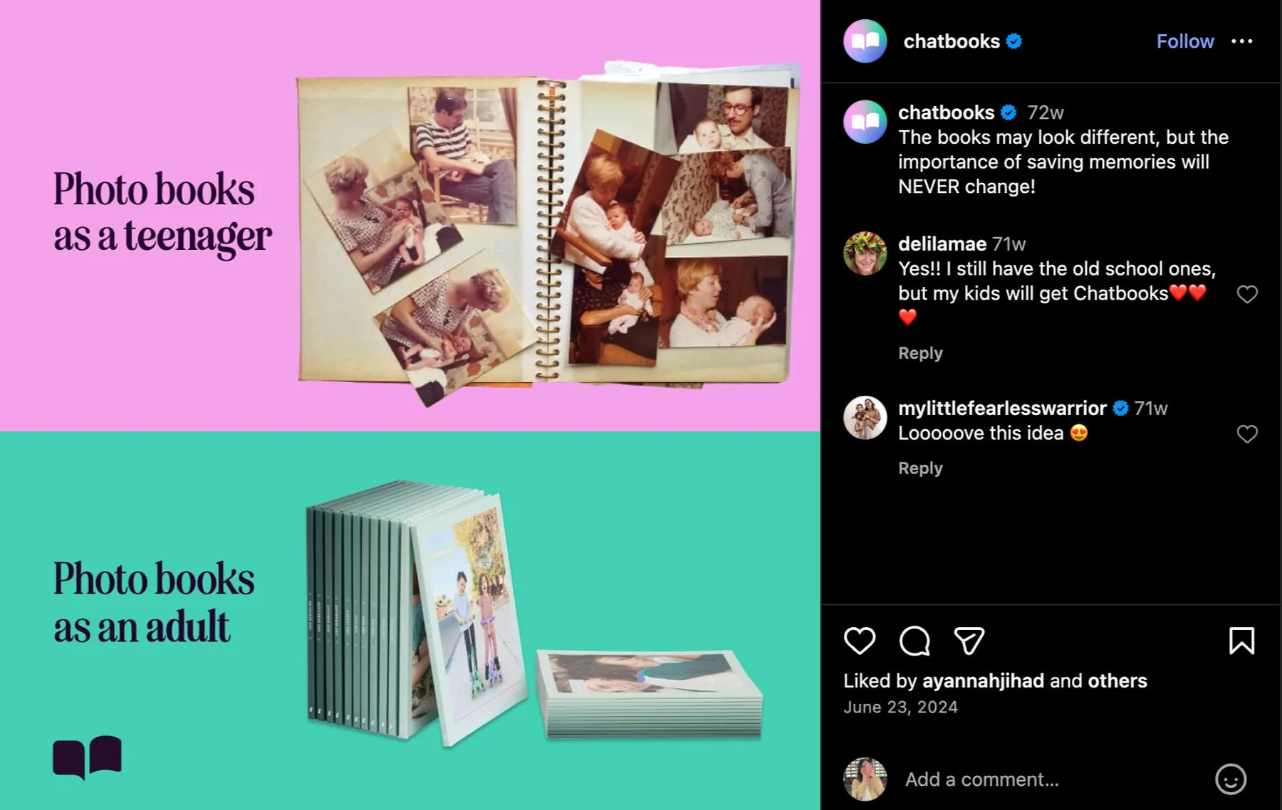
Photo books as a teenager vs as an adult post
Mother's Day 2024

Warm, nostalgic, and built to convert

I helped build the in-house campaign: ads, in-feed posts and an email newsletter centered on love, family and keepsake memories.

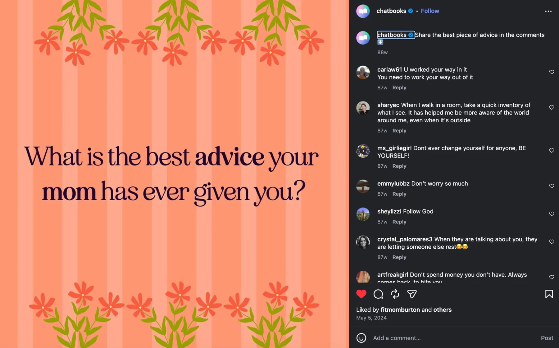
Mother's Day engagement post
Custom photo book

My cover, on the shelf

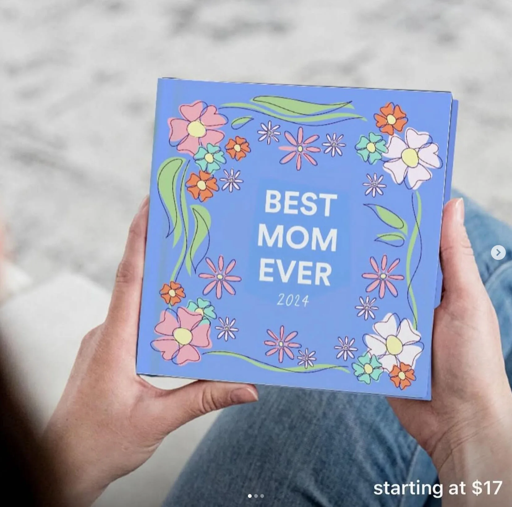
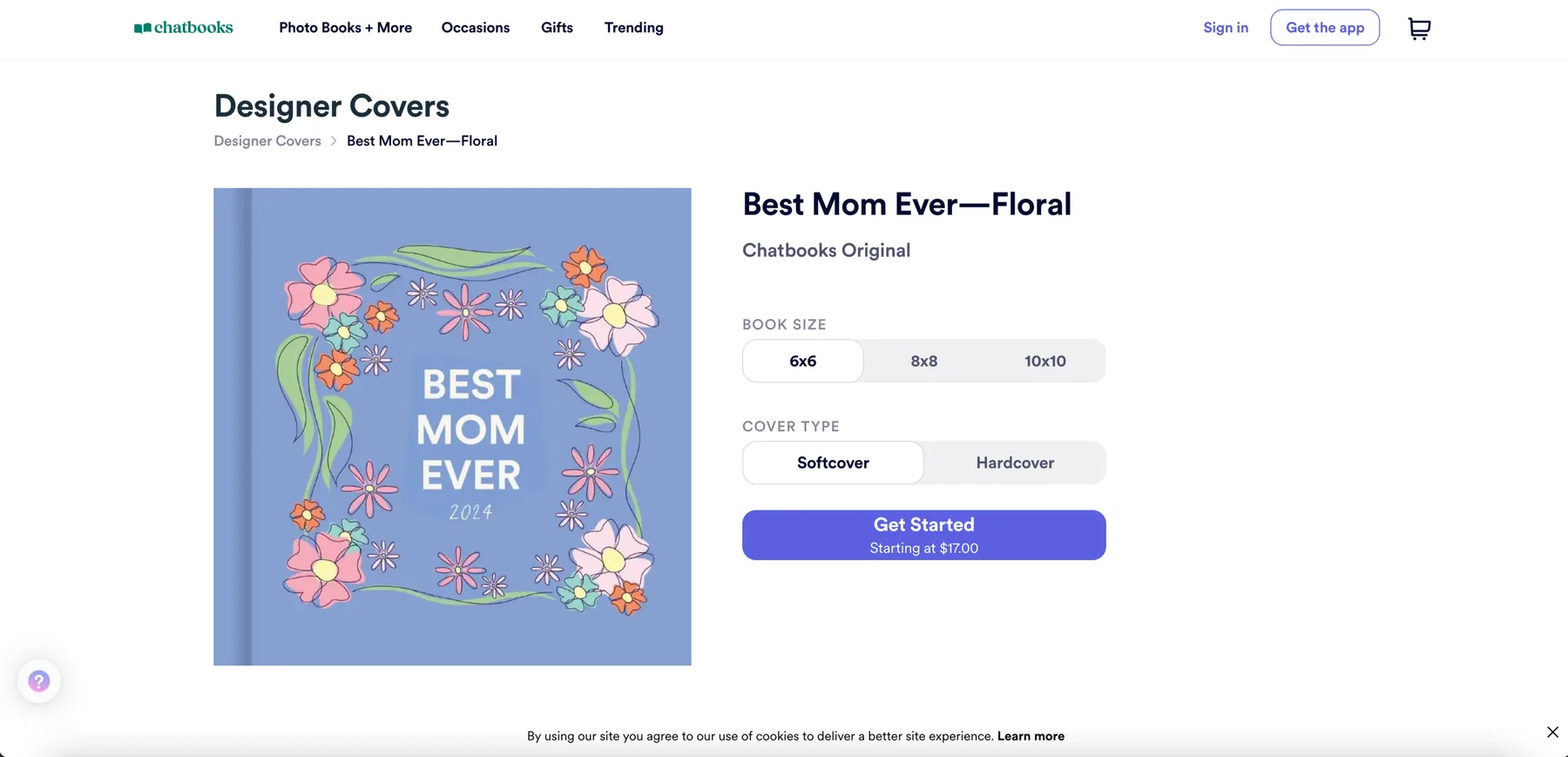
Beyond marketing, I pitched an original cover for the limited-edition Mother's Day collection. It was picked and sold on chatbooks.com alongside the core creative team's designs.

Best Mom Ever floral photo book cover
The cover live on the Chatbooks store
Father's Day 2024

Same brand, different energy

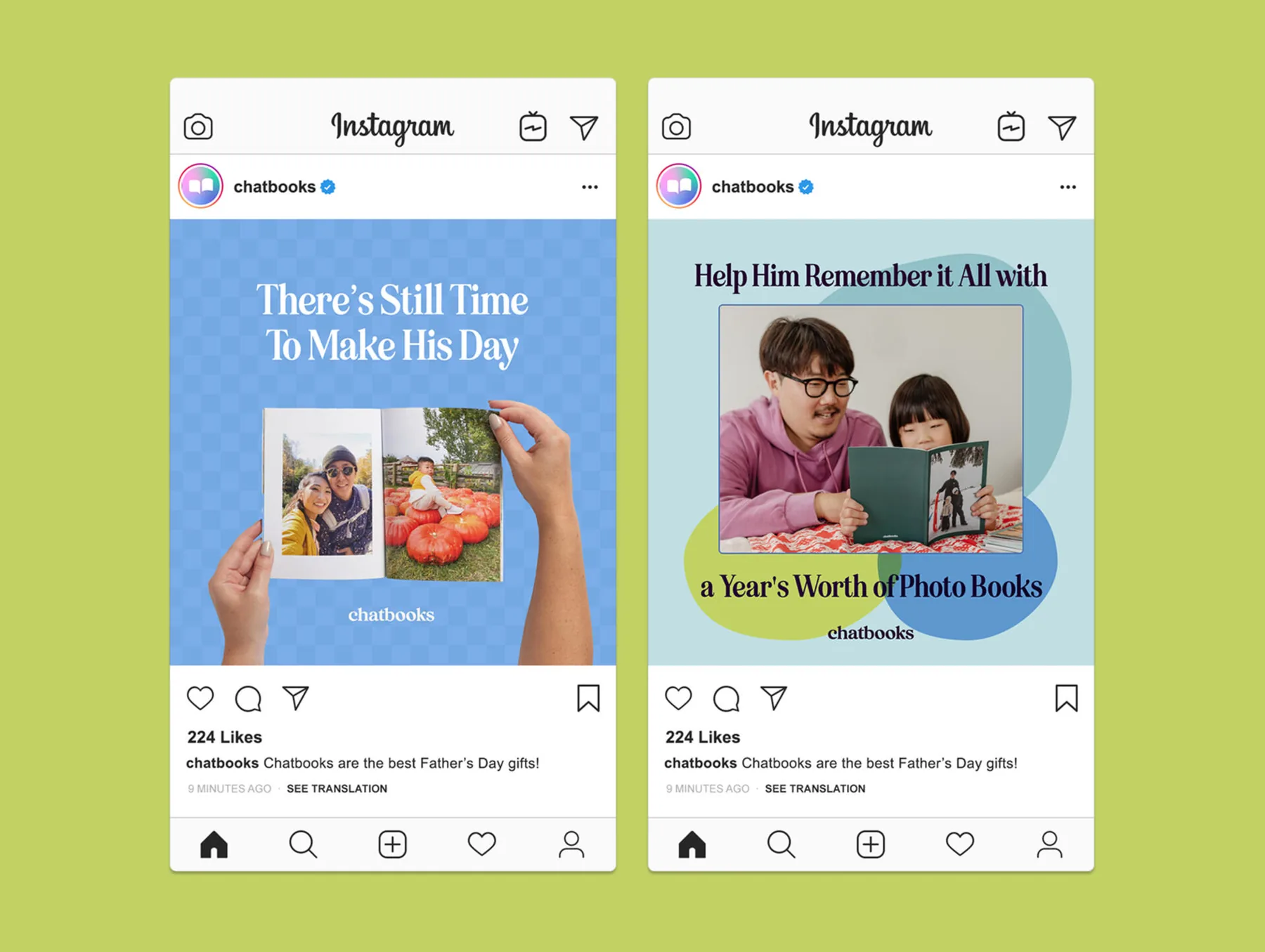
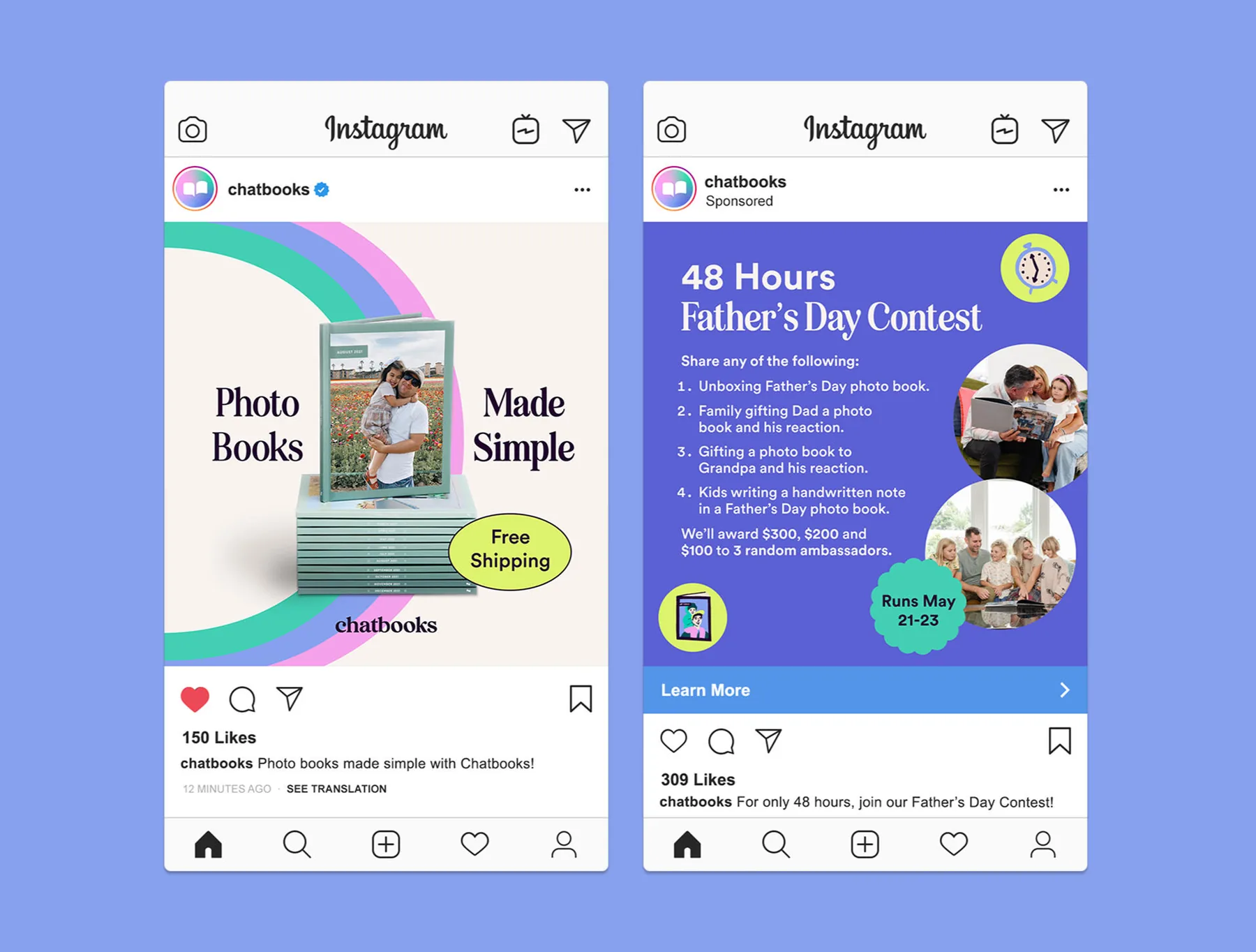
Where Mother's Day leaned nostalgic, Father's Day was meant to feel vibrant and fun, celebrating dads and father figures.

Father's Day Instagram ads
Father's Day contest posts
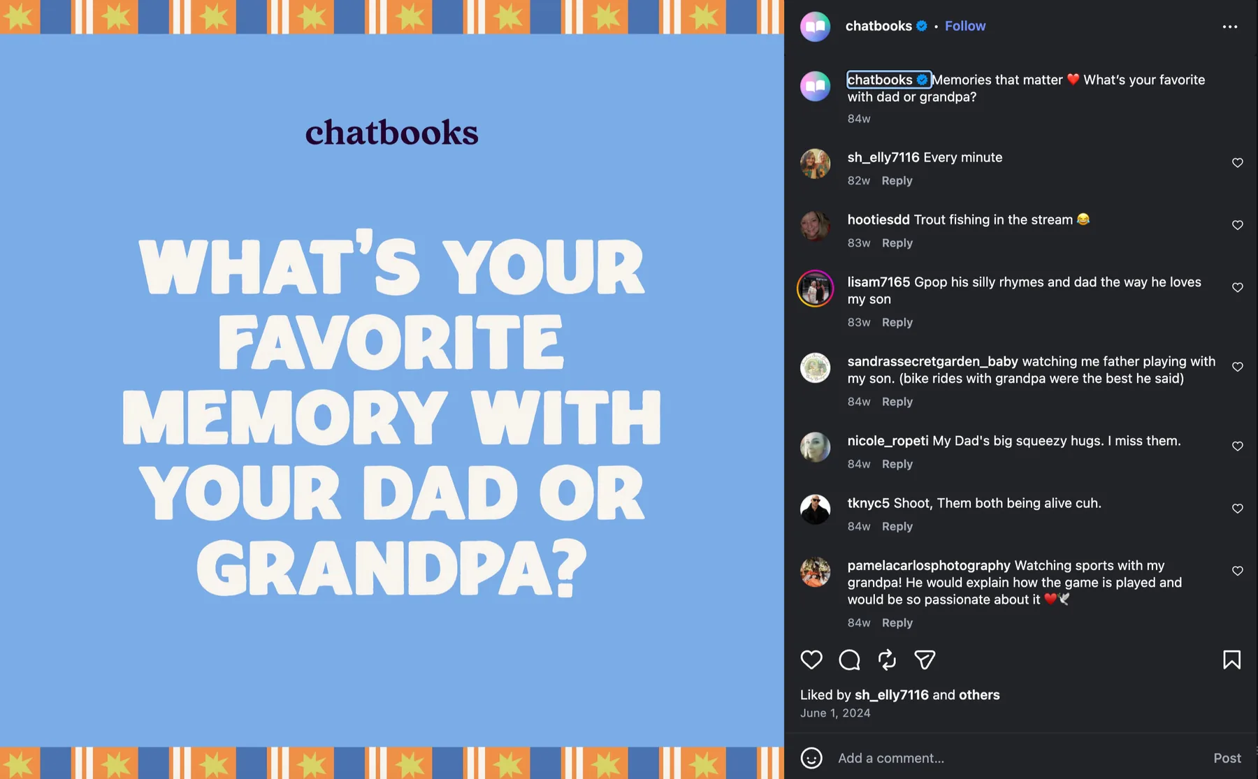
Favorite memory with dad engagement post
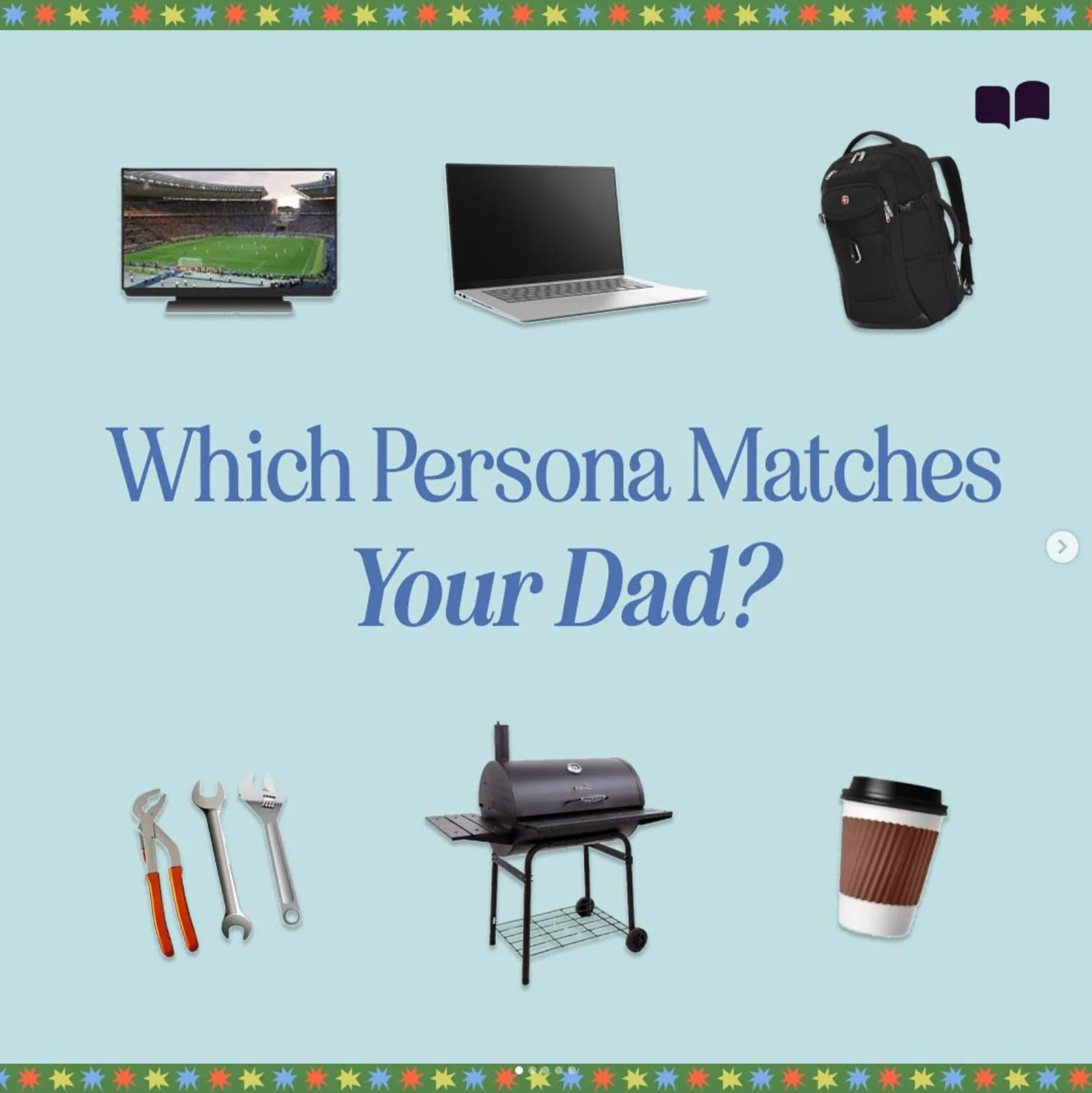
Which persona matches your dad post